
The direction, version three
Your team approved the refined direction with small changes. This version makes them: more of the band, several spice colors from one horn, the patterns shown in use, and the delta marked as a map.
Nothing more is needed from you. If something still looks off, use the form at the bottom of the page.
What we heard
Round 2 feedback from three people on your team, and what each point changed. Earlier rounds are on the Round 2 and Round 1 pages.
The colors, the instruments, the logo in the year and the spice patterns all landed.
What we did: kept all of it. Lockup, color and type are unchanged.
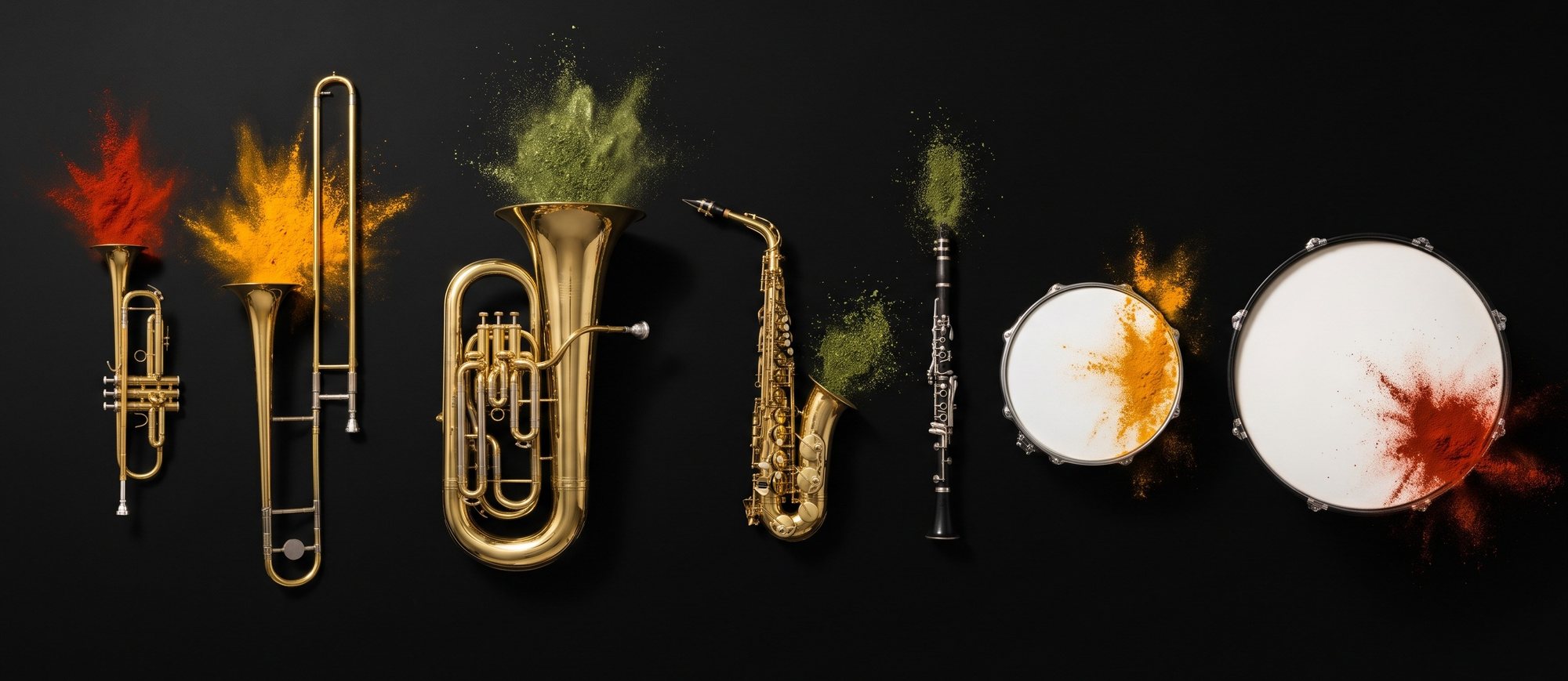
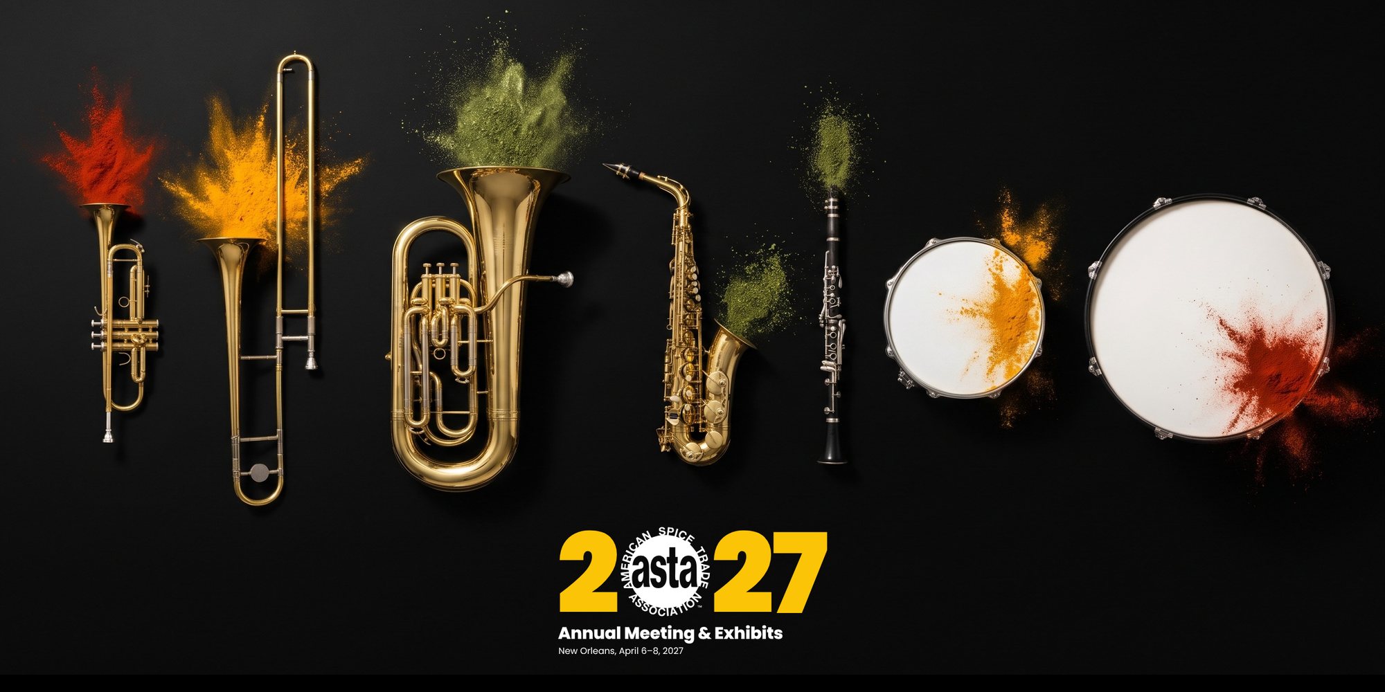
A second line band is tuba, trombones, trumpets, clarinet or saxophone, snare drum and bass drum. Use as many as possible, some on the same graphic.
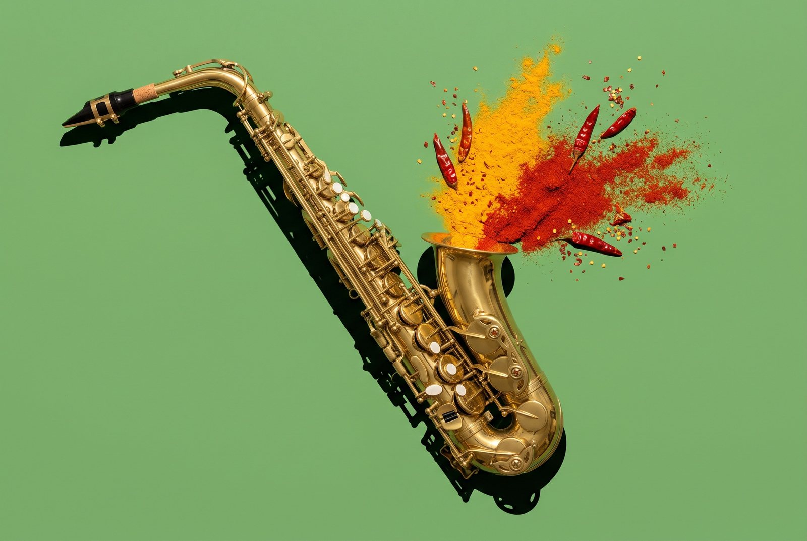
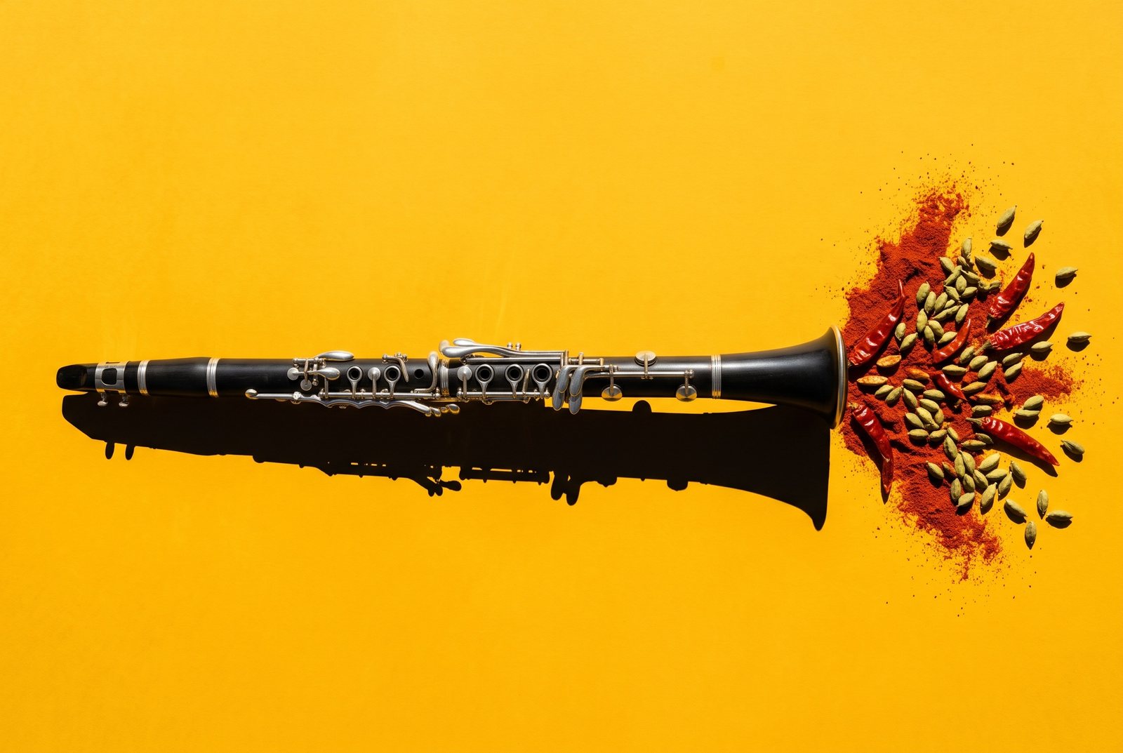
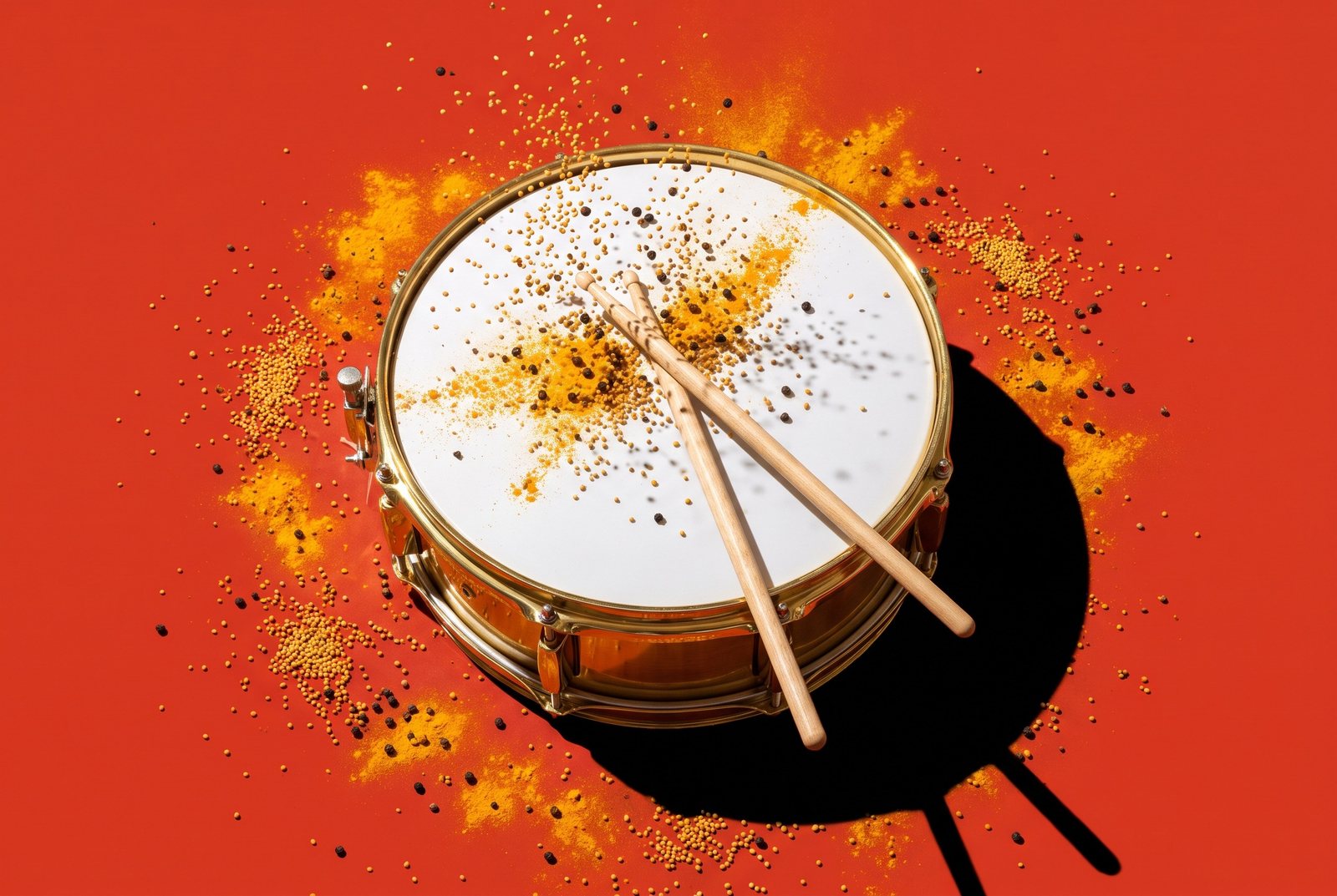
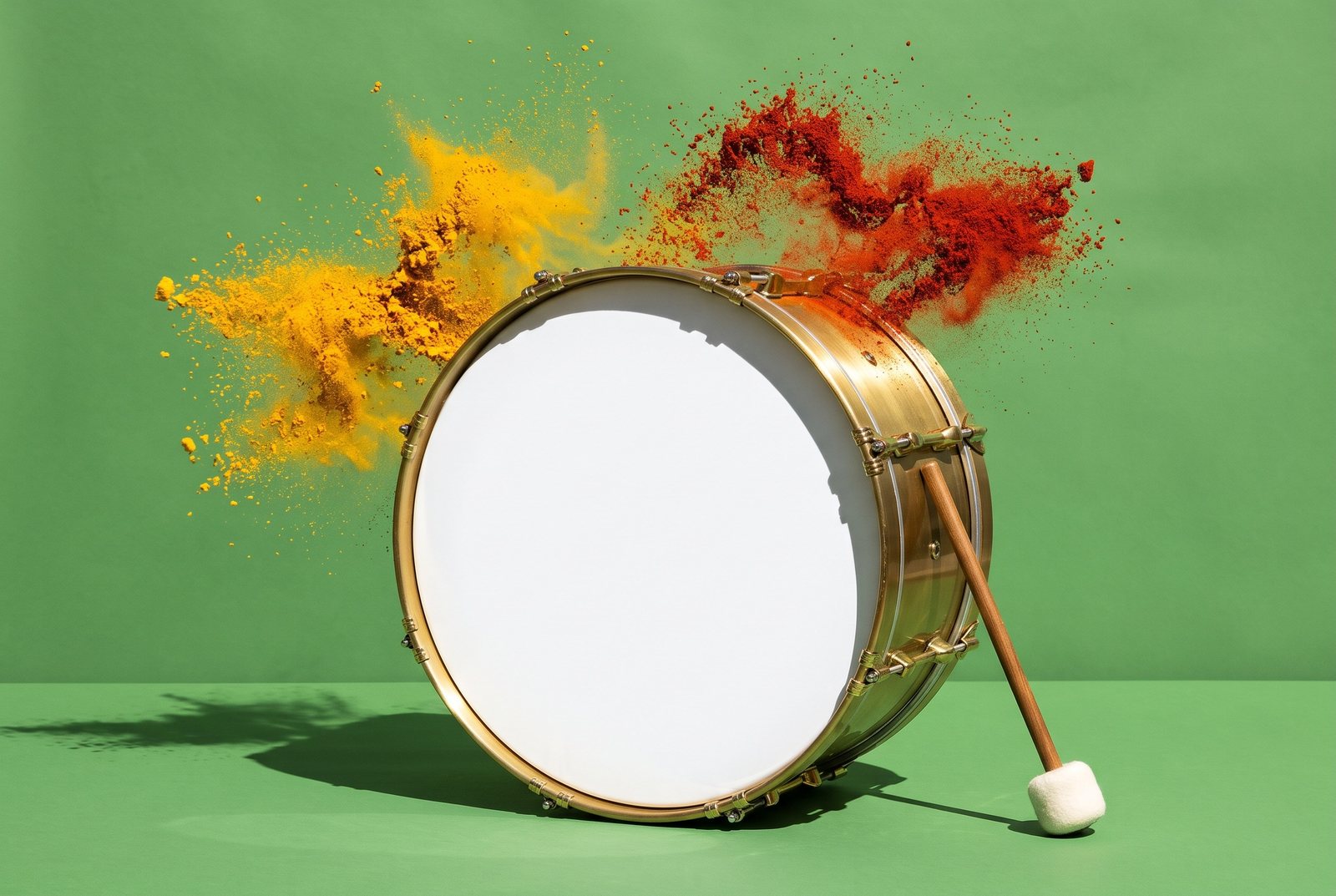
What we did: added a saxophone, a clarinet, a snare drum and a bass drum, and one image with the whole band together.
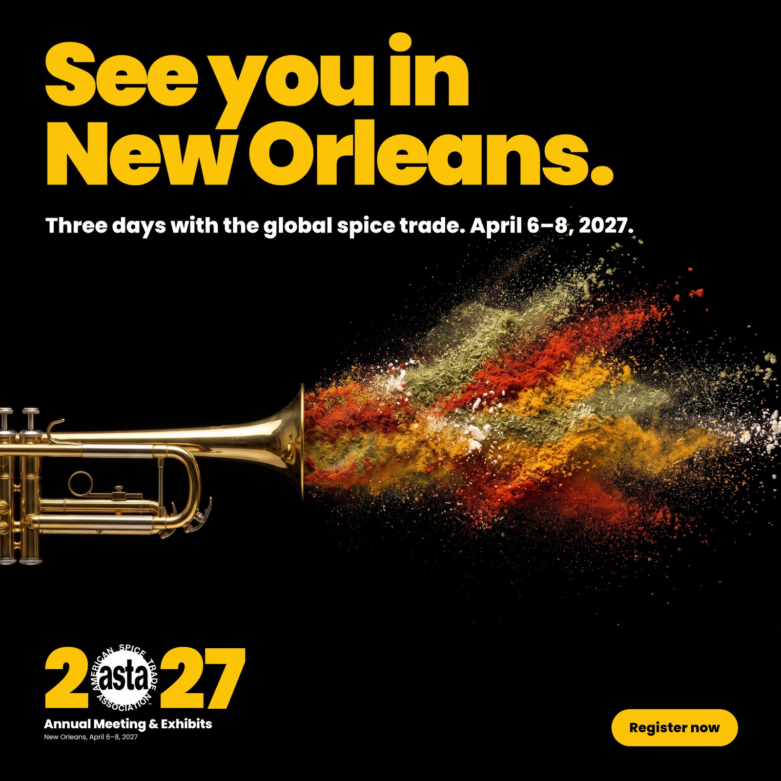
Like Holi in India, a major spice partner.
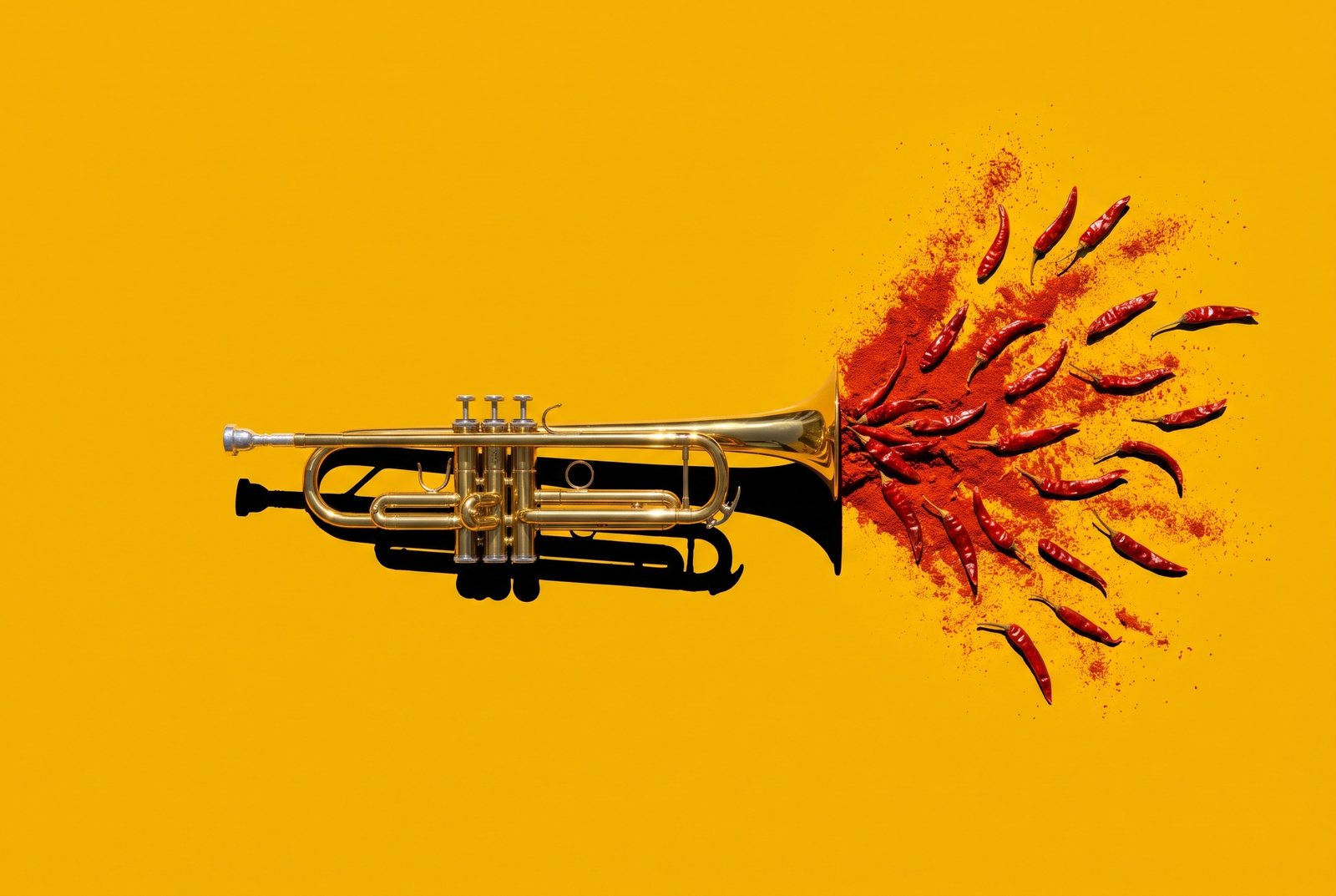
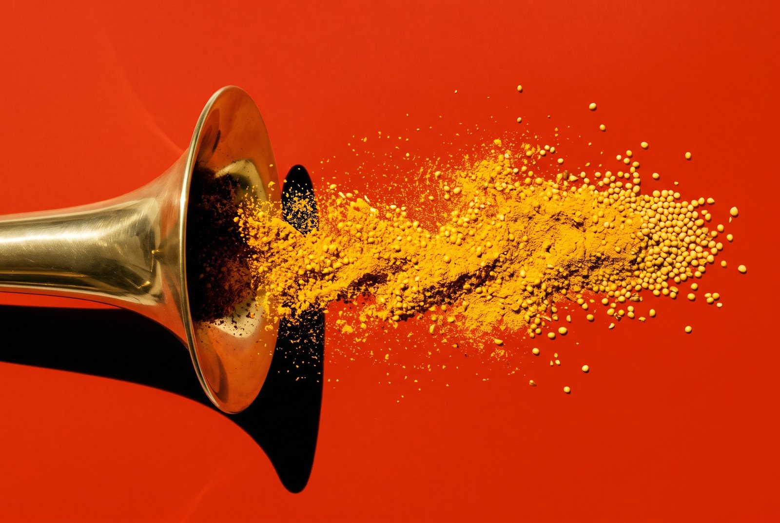
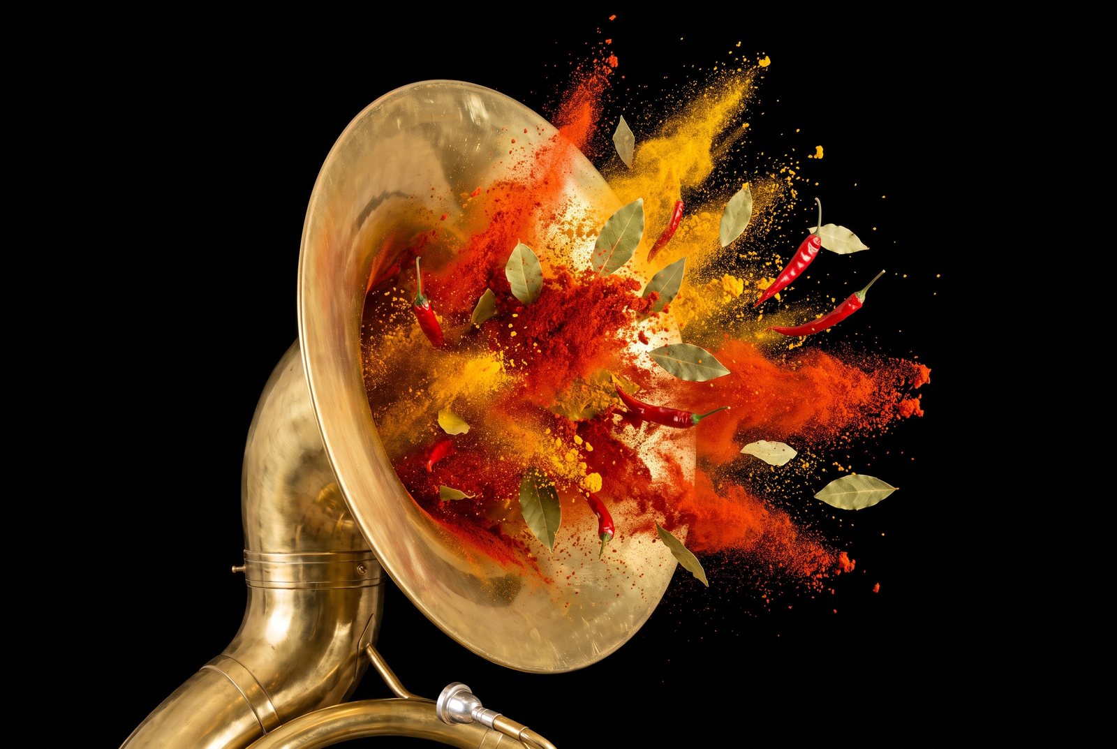
What we did: a trumpet with paprika, turmeric and green herb bursting out together. It now carries the music post.
Not everyone will get a “second line” reference.
What we did: the headline is gone. Instruments stay as imagery and the wording is plain.
They are well liked, but their job wasn’t clear.
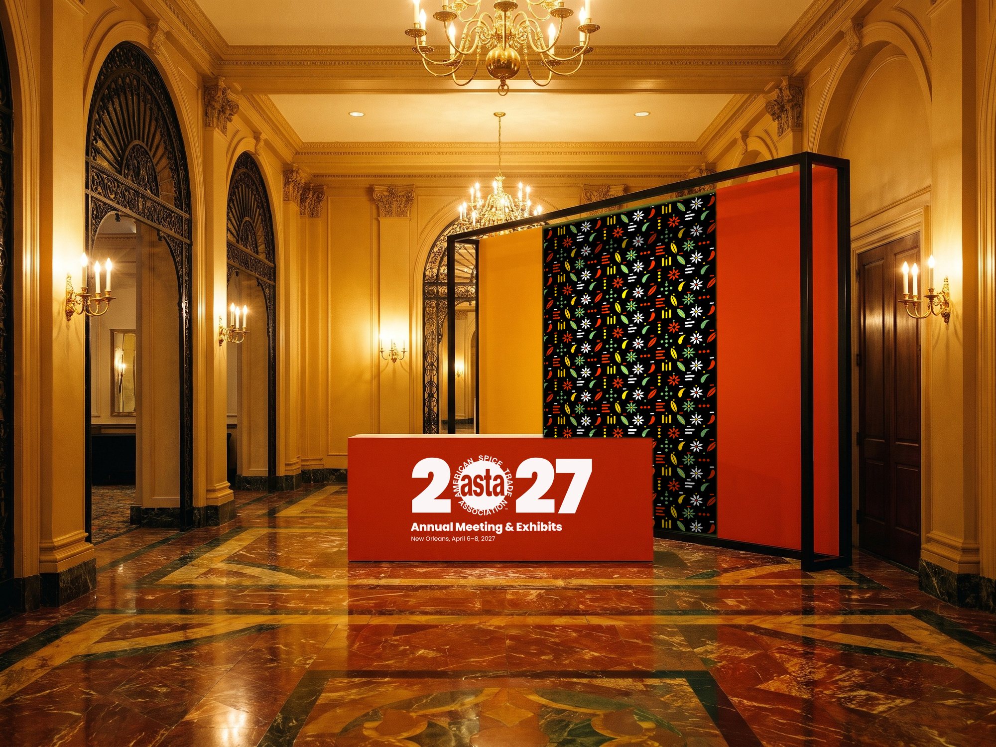
What we did: added examples: name badges and lanyards, a presentation slide, an email header and a signage panel.
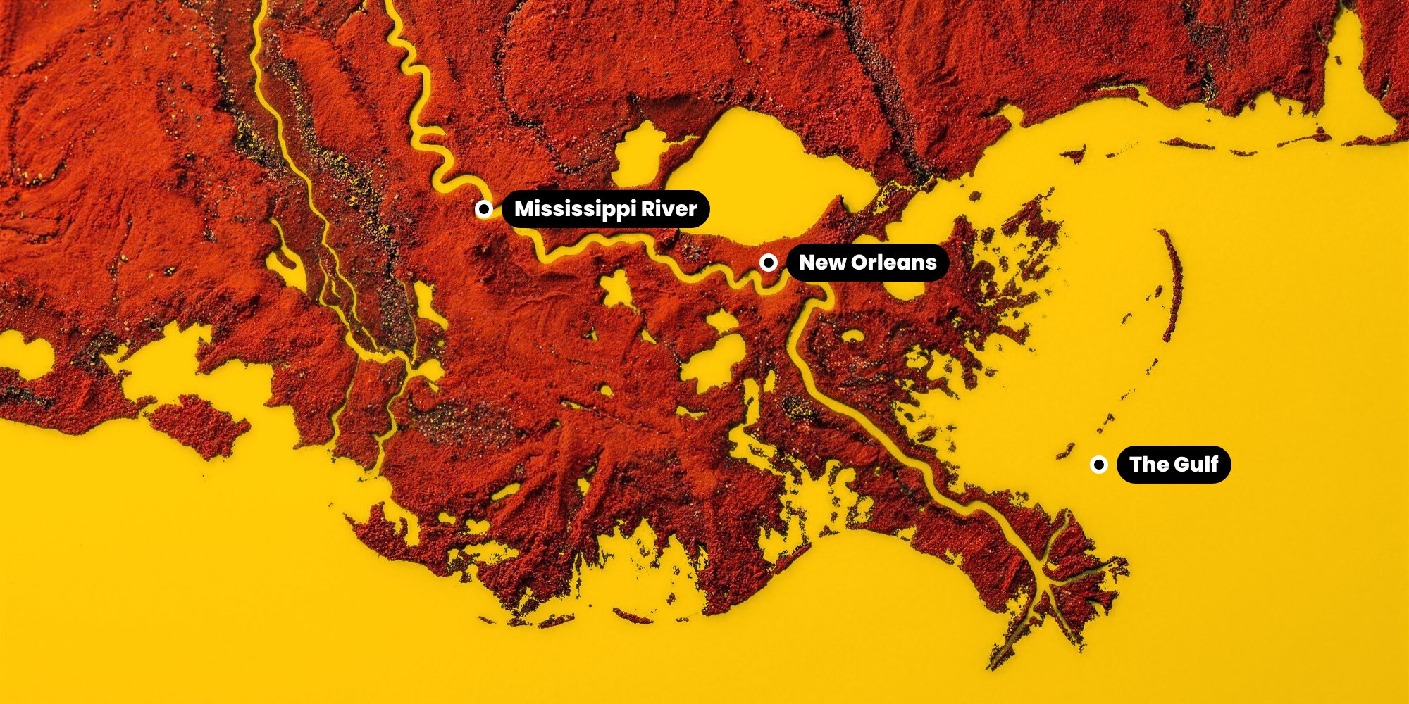
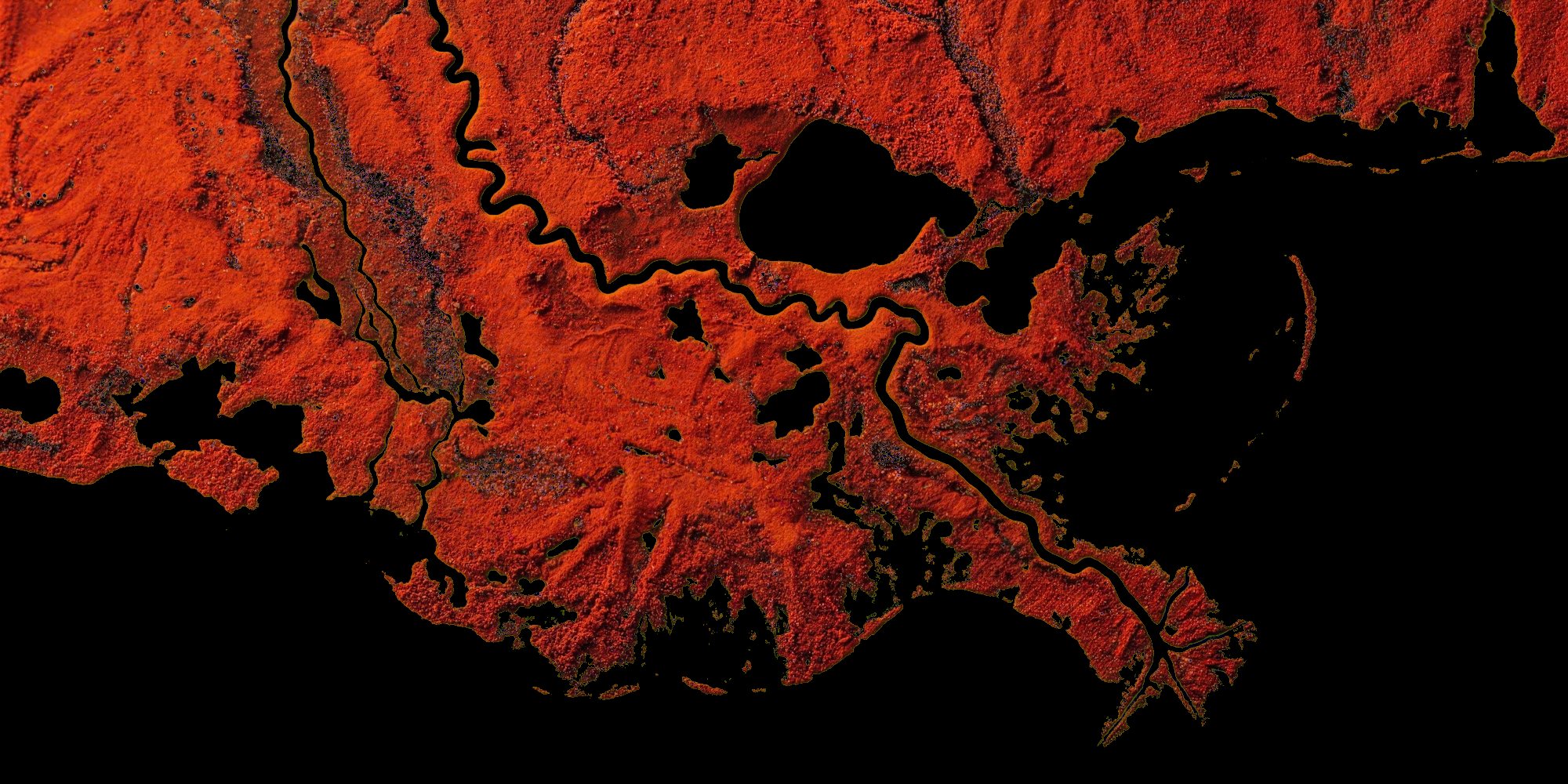
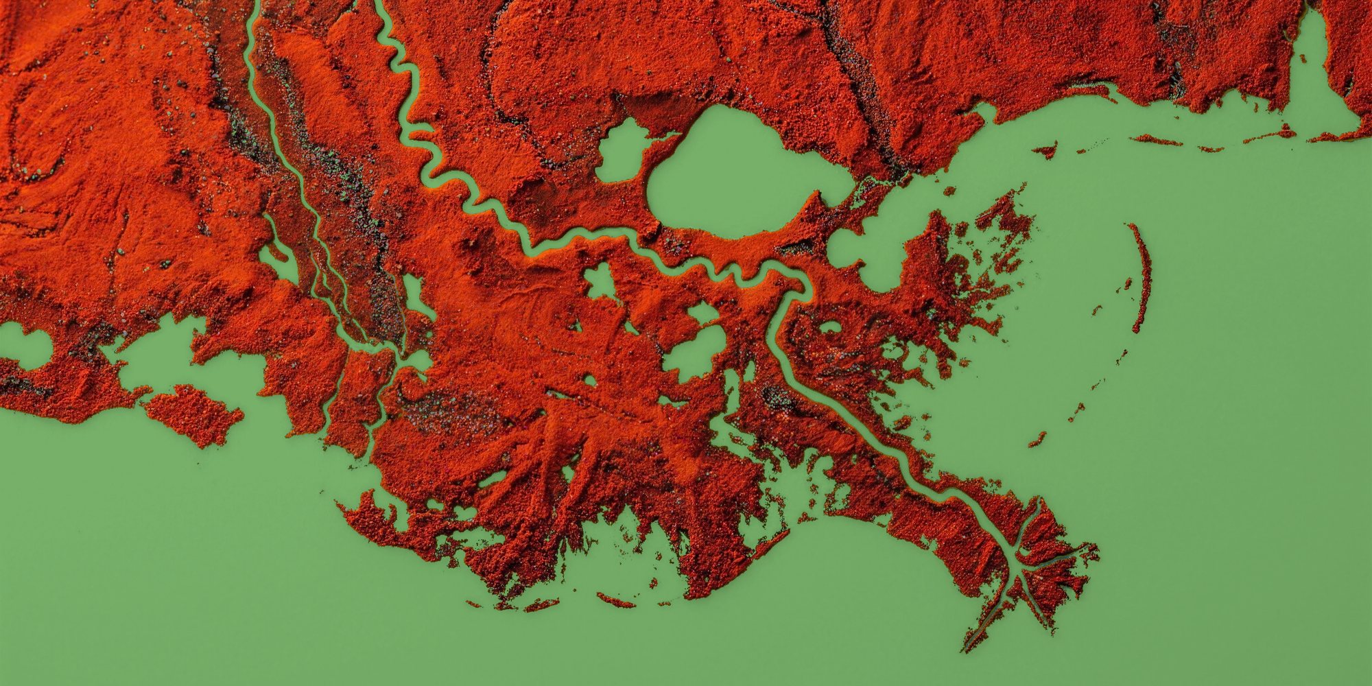
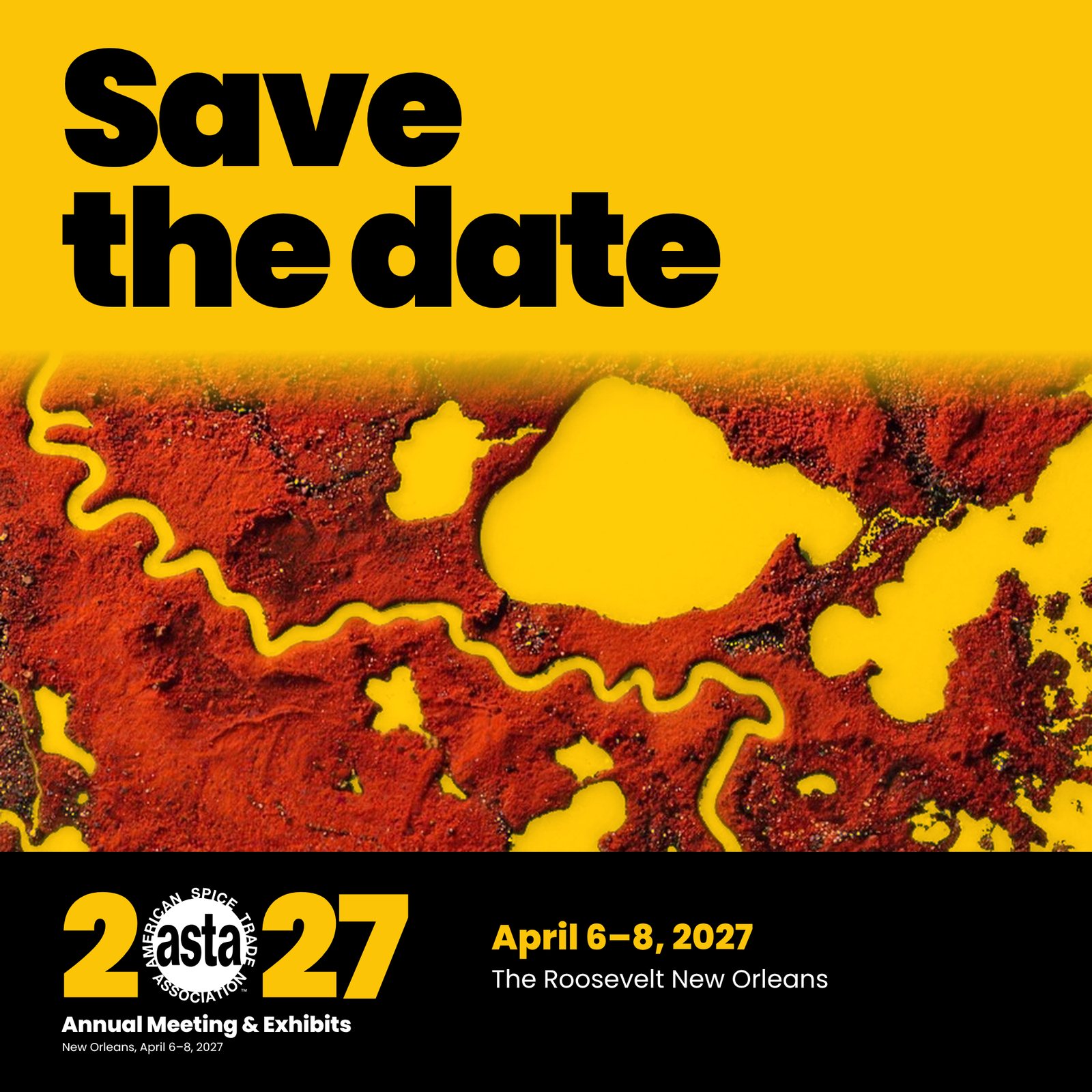
The delta should read clearly as a map.
What we did: the delta now shows New Orleans, the river and the Gulf.
Lead images: the delta and the band
Two ideas lead the event together. The Mississippi River delta, drawn in paprika, is a map of where the river meets the Gulf at New Orleans: the port, and the spice trade. The instruments bring the music.
Imagery shows the direction’s tone; final artwork will be refined for production.
Event lockup
ASTA’s logo stands in for the zero in 2027, set tight in Poppins Black. It comes in four versions so it always has a readable home.
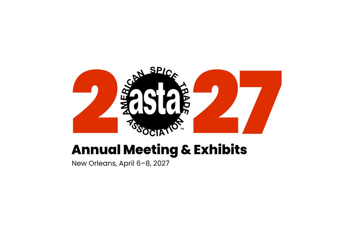
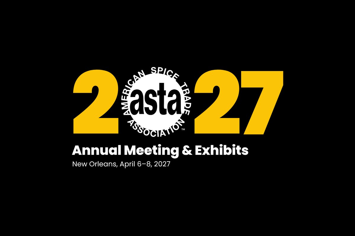
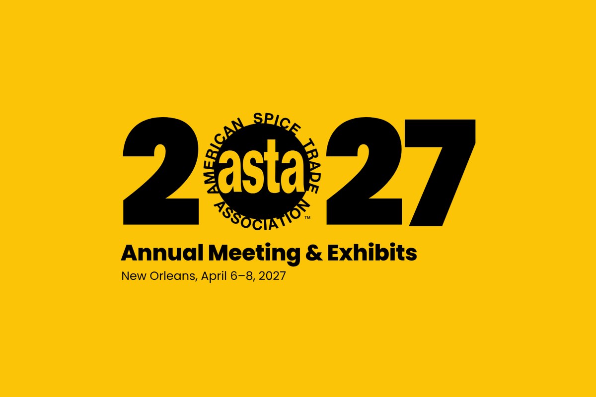
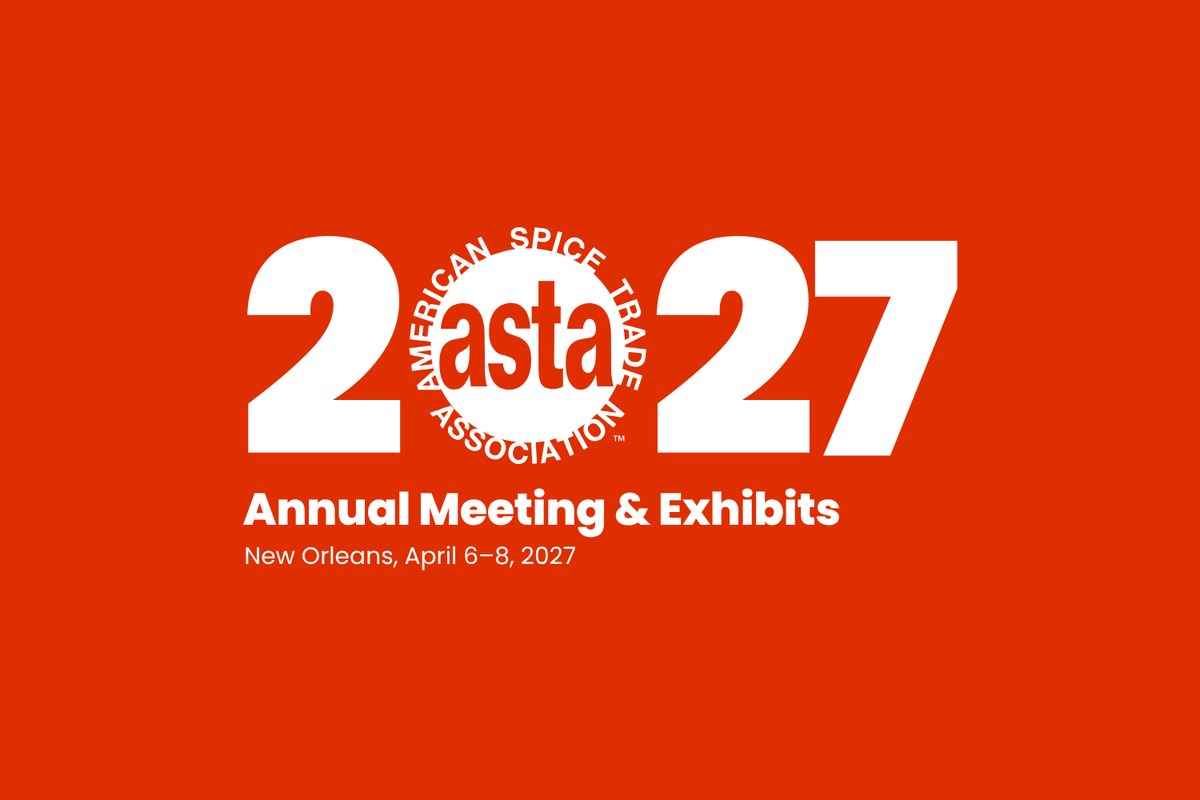
The logo in these previews is a tracing. Final files will use ASTA’s official logo artwork, unaltered.
Color
Four ASTA colors do the work. White, burnt cinnamon and polished brass support them.
Lead
Lead
Accent
Type, ironwork
Type, space
Supporting: quiet text on turmeric
Supporting: a calm background
Is red on yellow accessible? The rules
Short answer: not for text. We measured the contrast of every text and background pair against the web accessibility standard (WCAG 2 level AA), which asks for 4.5 to 1 for normal text and 3 to 1 for large text. Paprika on turmeric measures 2.86 to 1, under both. It stays in the brand as artwork, where nothing has to be read.
- Body text is black or white. Nothing else, at any size below a headline.
- Paprika with turmeric is for art only. Shapes, pattern and photos, yes. Words, dates or buttons, no.
- On turmeric: black type (13 to 1). Burnt cinnamon also passes (5.1 to 1).
- On paprika: white or black type. Both just pass (4.6 and 4.5 to 1), so keep it bold and not tiny.
- On herb green: black type only (7.6 to 1). White fails.
- On black: white, turmeric or herb green at any size. Paprika for headlines.
- On white: black for text, paprika for headlines. Turmeric and green are never text colors on white.
- Never rely on color alone to carry meaning. Pair it with words or shapes.
Every pair, measured
| Paprika text | Turmeric text | Herb green text | Black text | White text | Cinnamon text | Brass text | |
|---|---|---|---|---|---|---|---|
| On paprika | Aa2.86Not for text | Aa1.66Not for text | Aa4.54Any size | Aa4.62Any size | Aa1.78Not for text | Aa2.15Not for text | |
| On turmeric | Aa2.86Not for text | Aa1.71Not for text | Aa13.00Any size | Aa1.61Not for text | Aa5.10Any size | Aa1.32Not for text | |
| On herb green | Aa1.66Not for text | Aa1.71Not for text | Aa7.57Any size | Aa2.77Not for text | Aa2.97Not for text | Aa1.29Not for text | |
| On black | Aa4.54Any size | Aa13.00Any size | Aa7.57Any size | Aa21.00Any size | Aa2.54Not for text | Aa9.80Any size | |
| On white | Aa4.62Any size | Aa1.61Not for text | Aa2.77Not for text | Aa21.00Any size | Aa8.24Any size | Aa2.14Not for text | |
| On cinnamon | Aa1.78Not for text | Aa5.10Any size | Aa2.97Not for text | Aa2.54Not for text | Aa8.24Any size | Aa3.85Large only | |
| On brass | Aa2.15Not for text | Aa1.32Not for text | Aa1.29Not for text | Aa9.80Any size | Aa2.14Not for text | Aa3.85Large only |
Contrast ratio for each text color (across) on each background (down). “Any size” is 4.5 to 1 or more. “Large only” is 3 to 1 or more, for type 24px and up, or 19px and up in bold. “Not for text” is under 3 to 1.
Typography
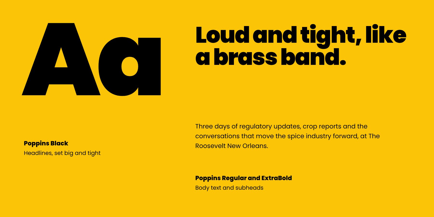
All Poppins, ASTA’s primary font. Poppins Black for headlines, set big and tight. Poppins Regular for text and ExtraBold for subheads.
Pattern
The busy pepper-and-leaf pattern from Bold, redrawn as clean vector art: syncopated bars and dots with chile, bay leaf and star anise. It repeats forever and scales to any size. The ironwork version is a gallery railing in ASTA black.
How the patterns get used
The patterns are the glue. They fill the spaces a photo can’t: edges, bands, backs and small items. Wherever one appears, it says “this is the Annual Meeting” without needing a picture.
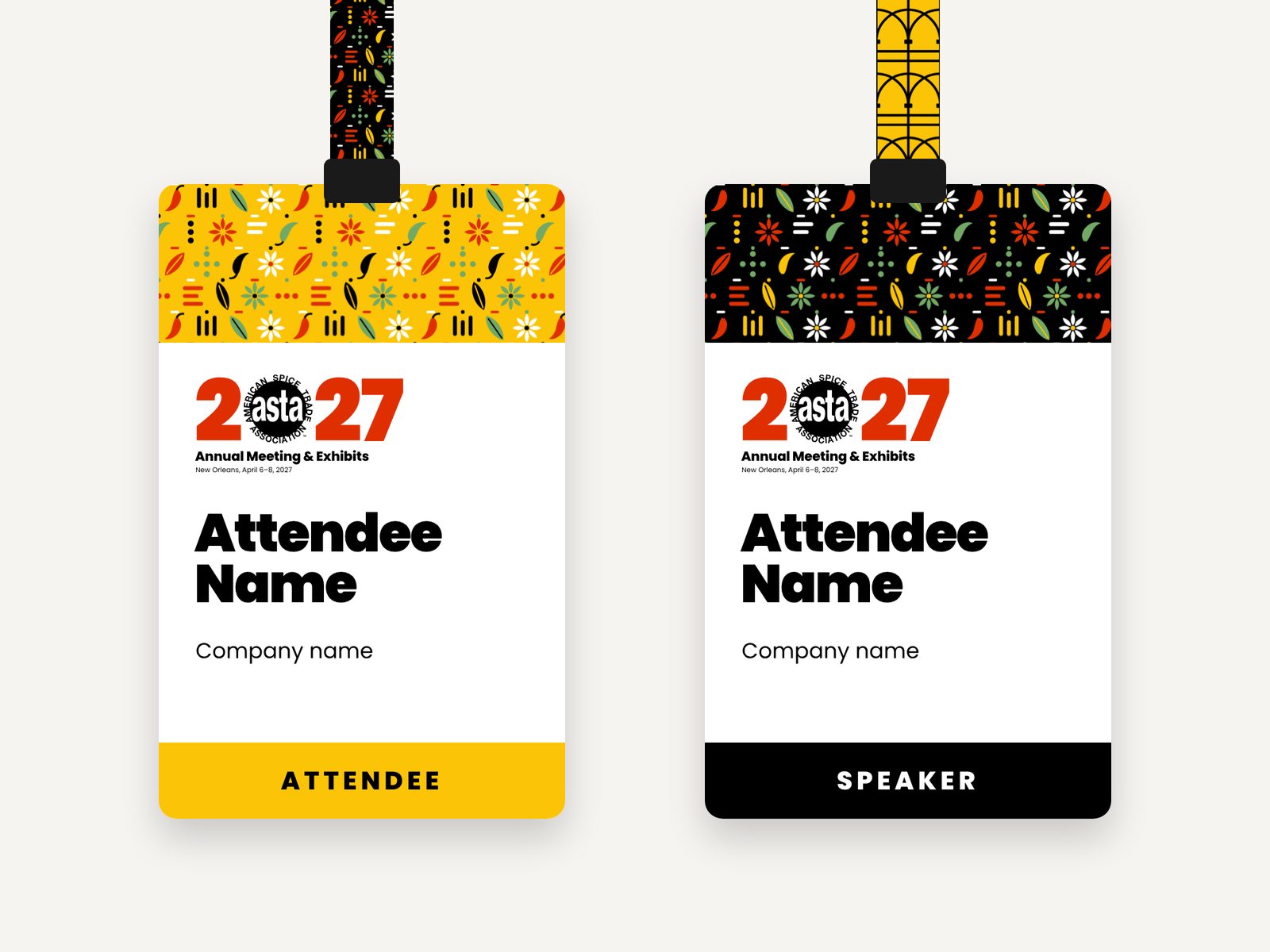
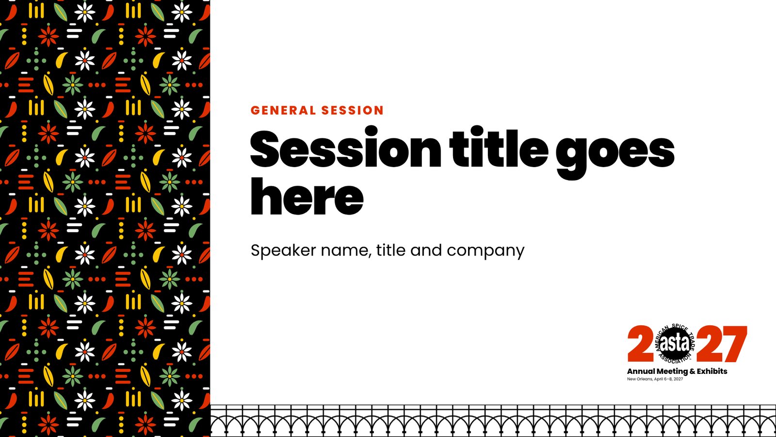
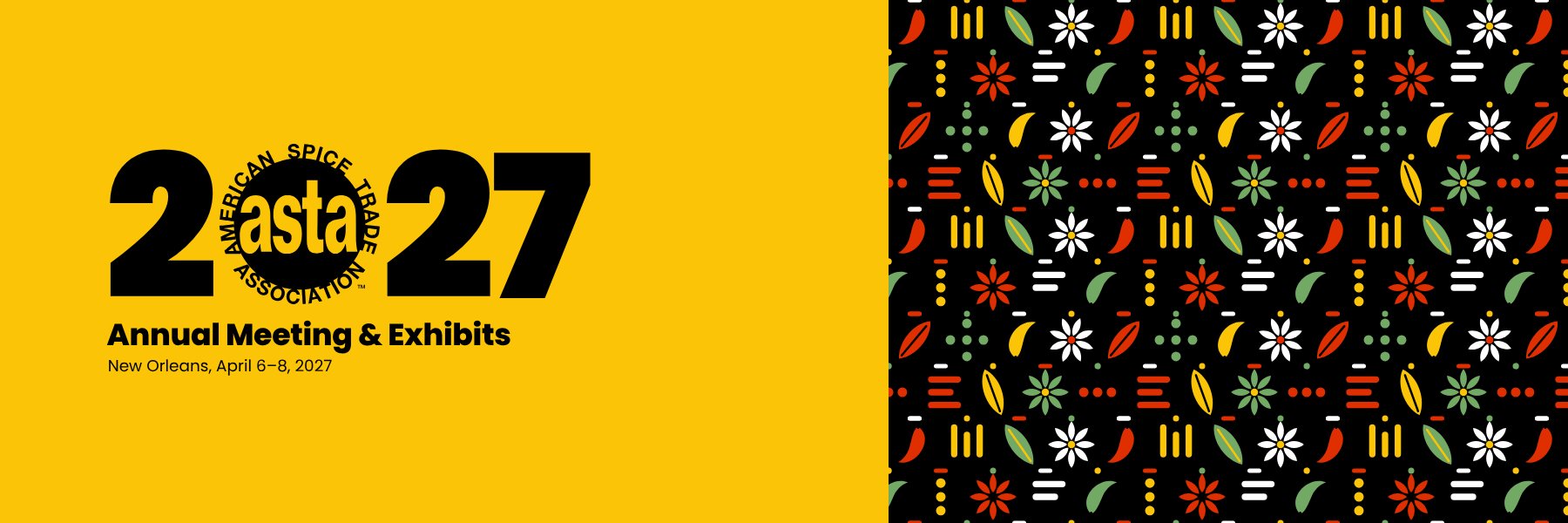
Also on signage: see the registration backdrop below. Other good homes are tote bags, table runners, folder linings and social post borders.
Music and spice
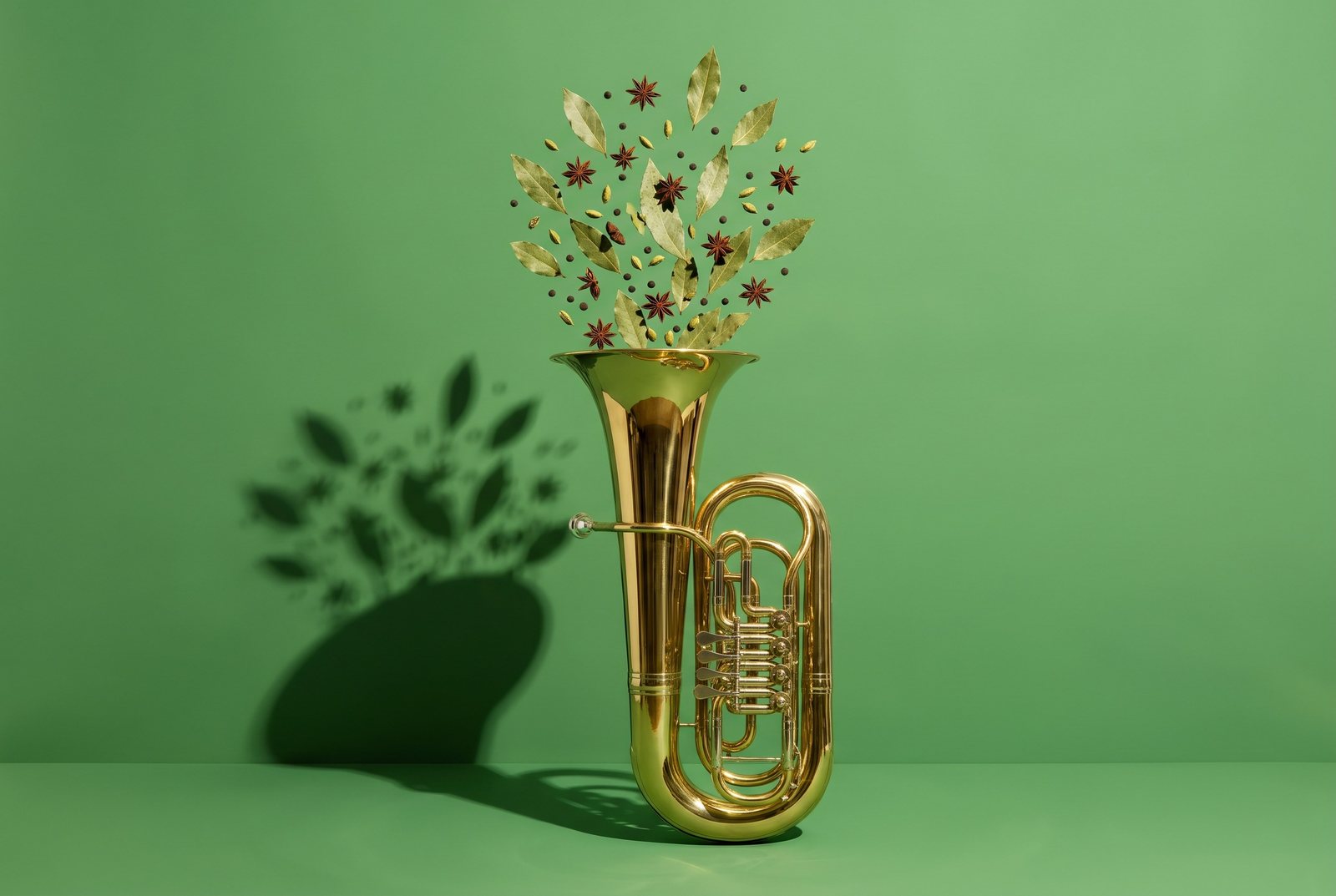
The band, one instrument at a time, each with spices pouring and bursting out on one of the brand colors. The energy comes from the objects and the color, so no words are needed to explain it.
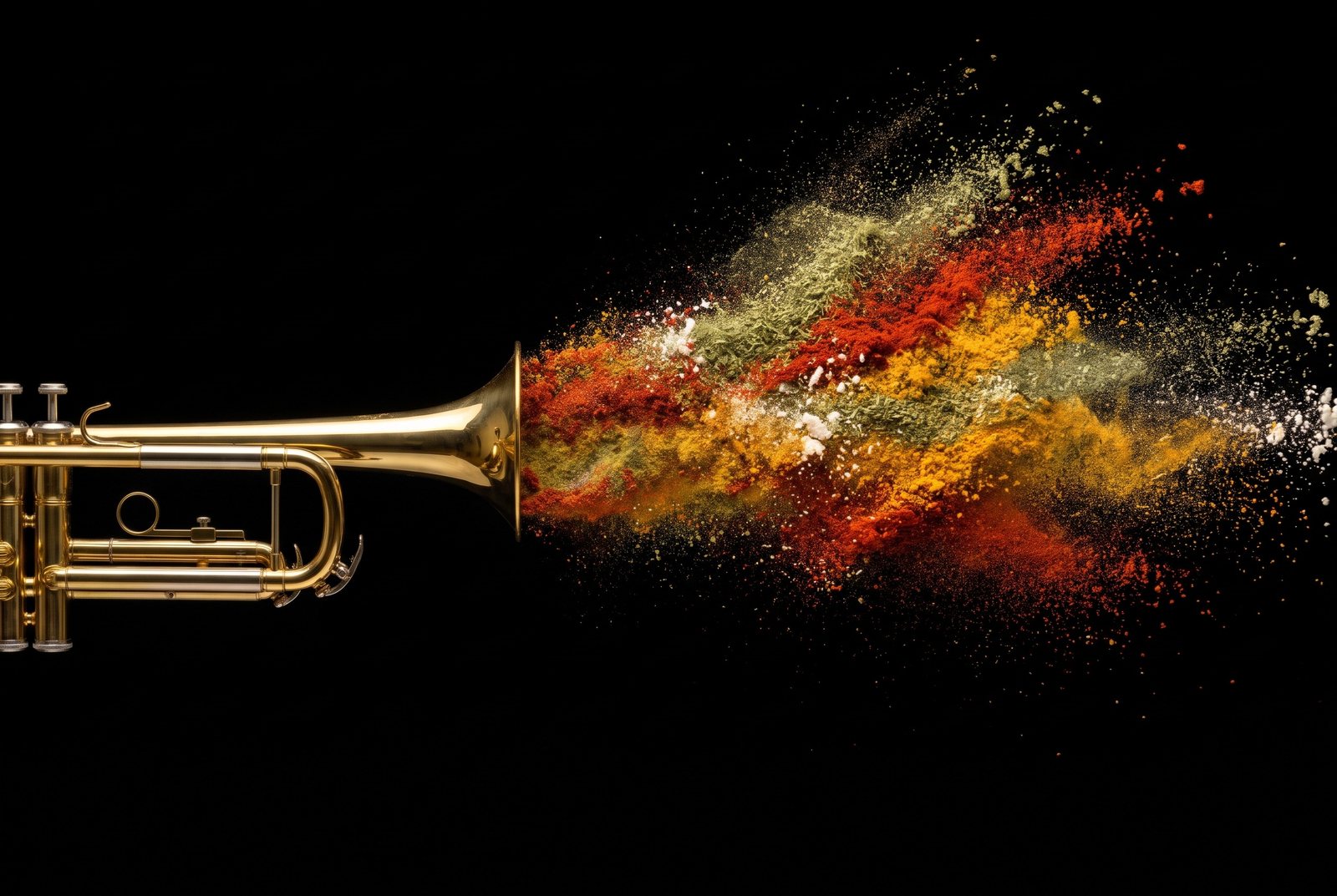
In use
How the pieces come together. Wording is placeholder.
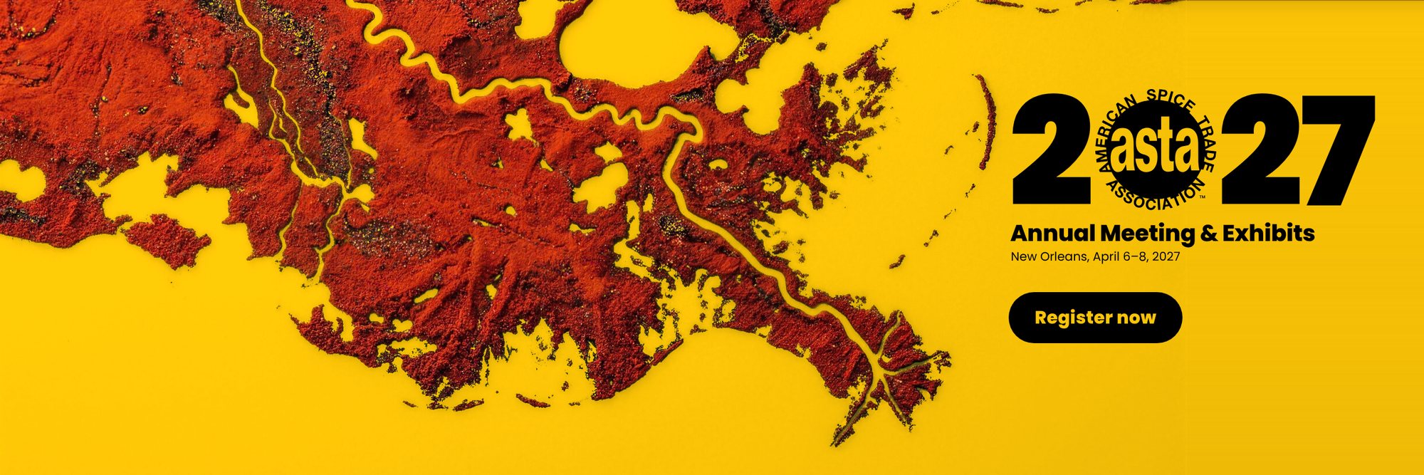
Imagery shows the direction’s tone; final artwork will be refined for production.
Anything else?
Your team approved this direction with small changes, and this version includes them. If anything still needs a tweak, tell us here. Each person can send their own response.