

Three directions for New Orleans
Each direction answers the same brief: a nod to New Orleans, a connection to the spice trade, and at least one ASTA brand color.
Jump to: Classic, Bold, Unexpected or the results.
Direction 1
Classic
Refined, clean, professional
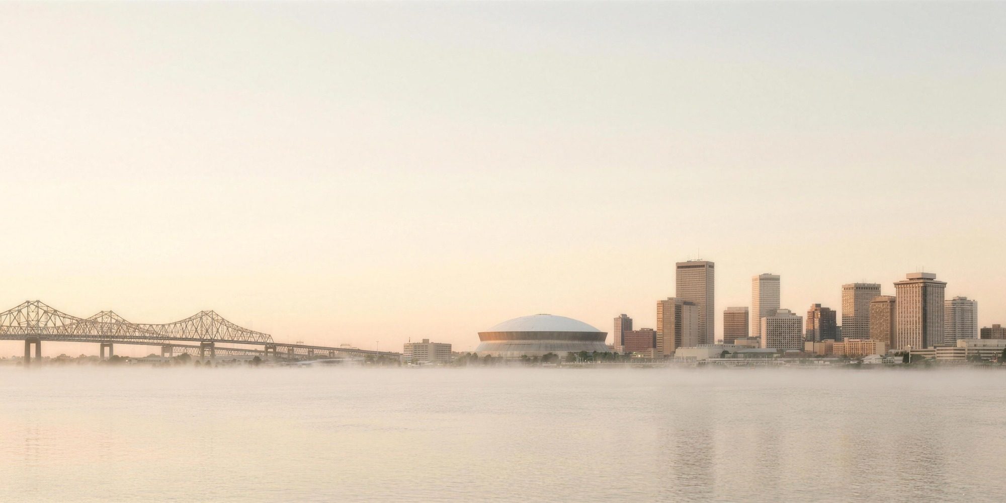
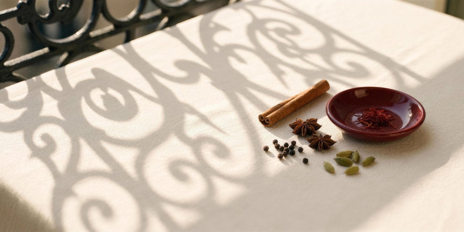
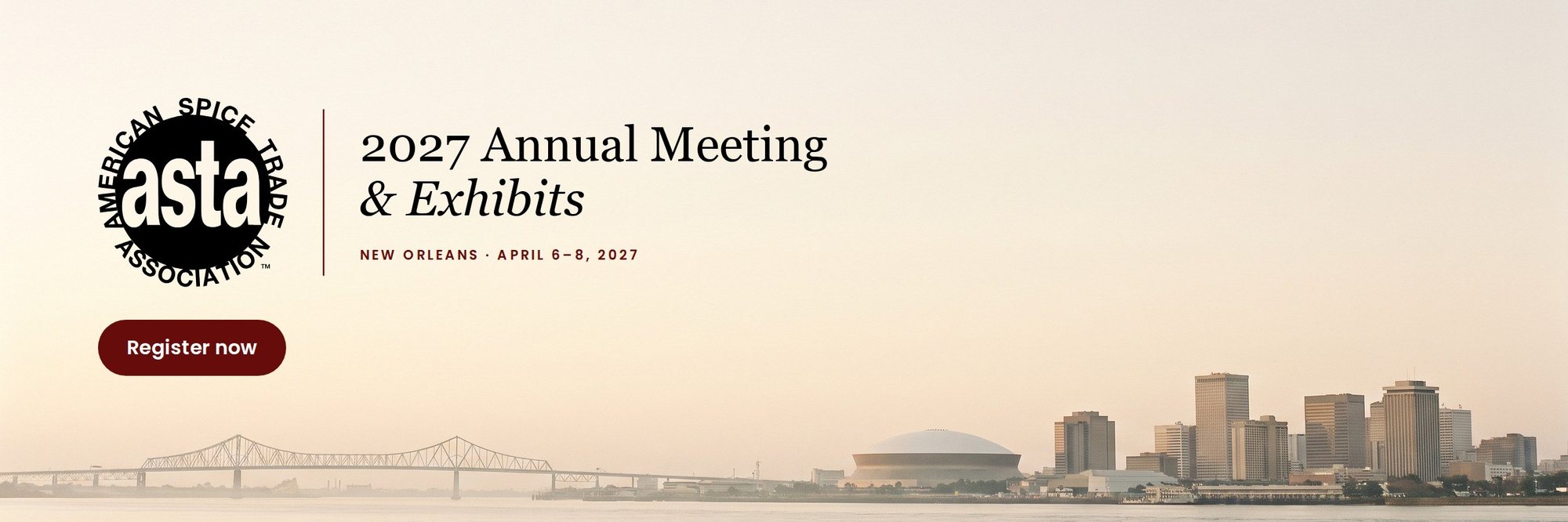
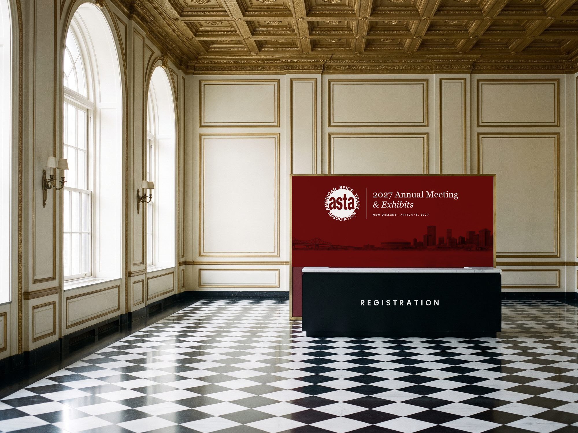
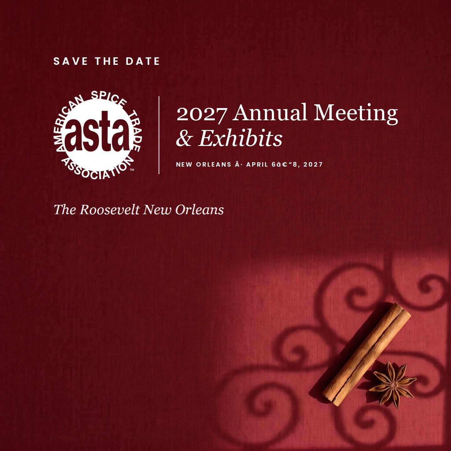
Quiet luxury at first light: the New Orleans skyline across a misty Mississippi, whole spices in soft ironwork shadow, and ASTA’s deep red as the single strong accent.
Event lockup
Color
Mostly ivory and white, black for type, and deep red as the one strong accent.
Typography
- Headlines
- Georgia
- Body
- Poppins Light and SemiBold
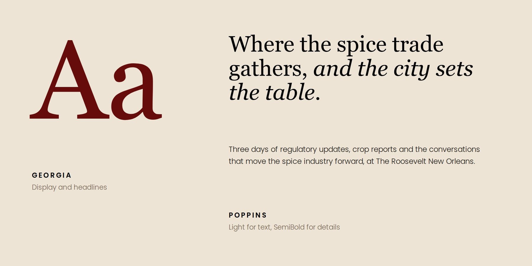
Georgia gives headlines an editorial, timeless voice. Poppins keeps dates, details and body text clean.
Moodboard


Visual style
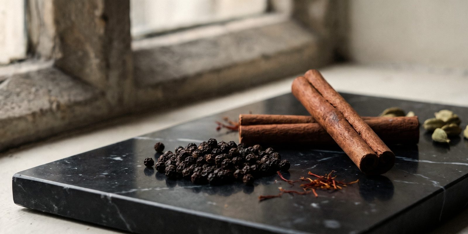
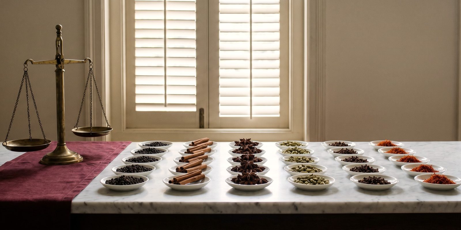
The skyline at dawn leads, with soft morning light, generous negative space and editorial still lifes of whole spices: cinnamon, star anise, saffron, cardamom and black pepper.
Pattern
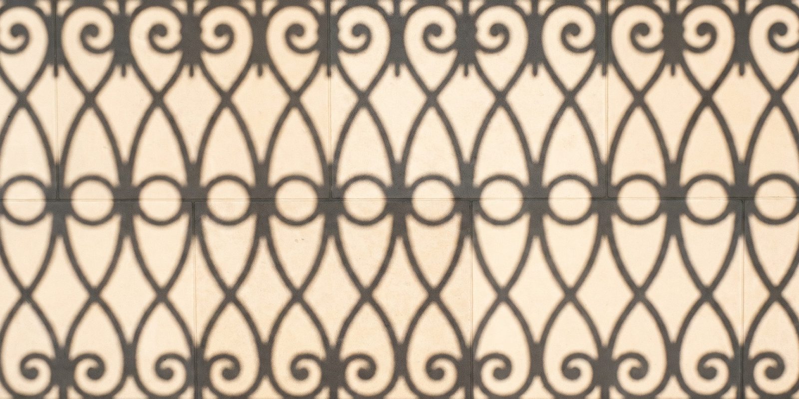
A circle-and-scroll ironwork lattice, drawn from a real gallery shadow and simplified into a quiet brand pattern.
In use
Direction 2
Bold
Vibrant, expressive, engaging
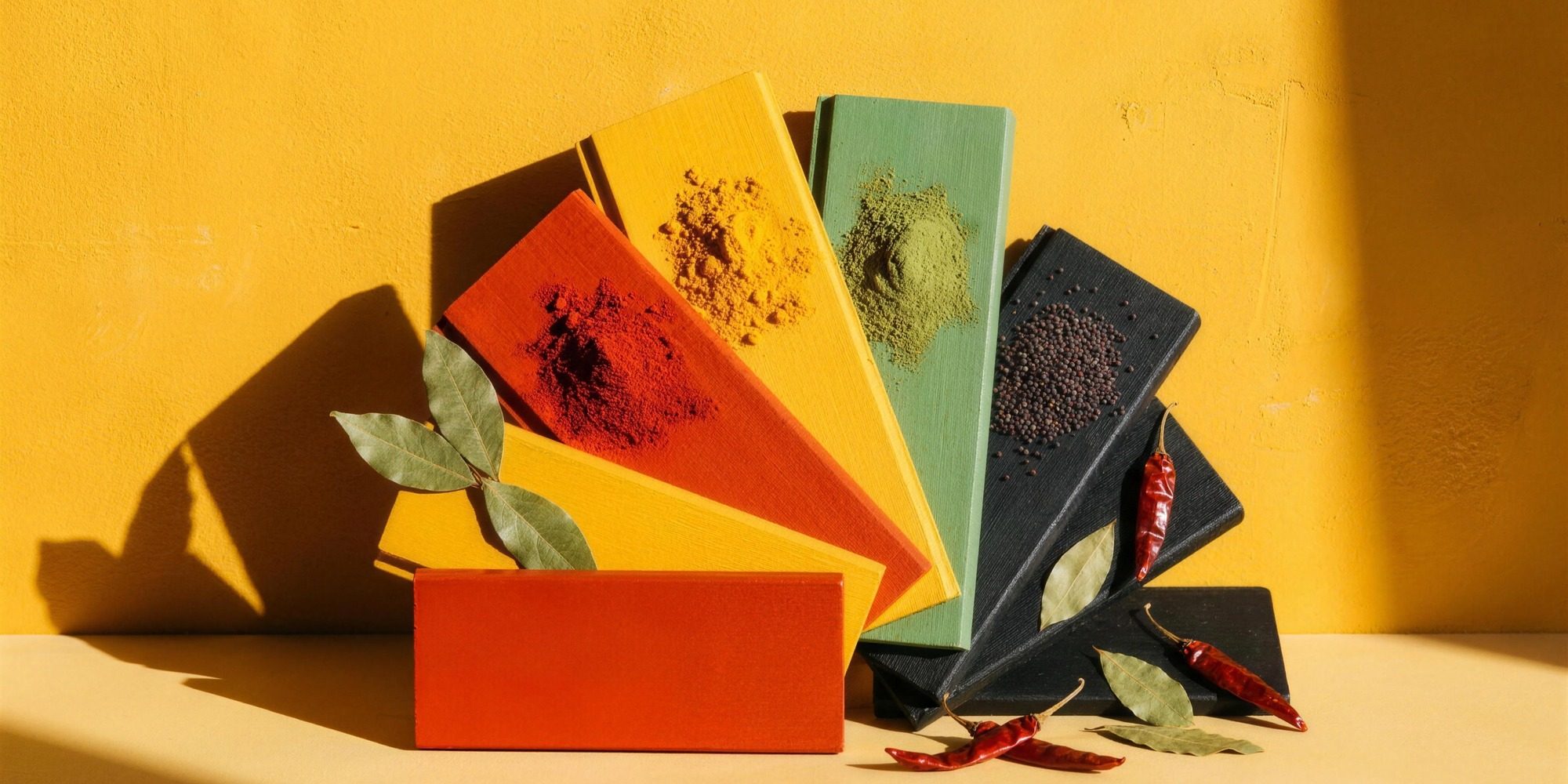
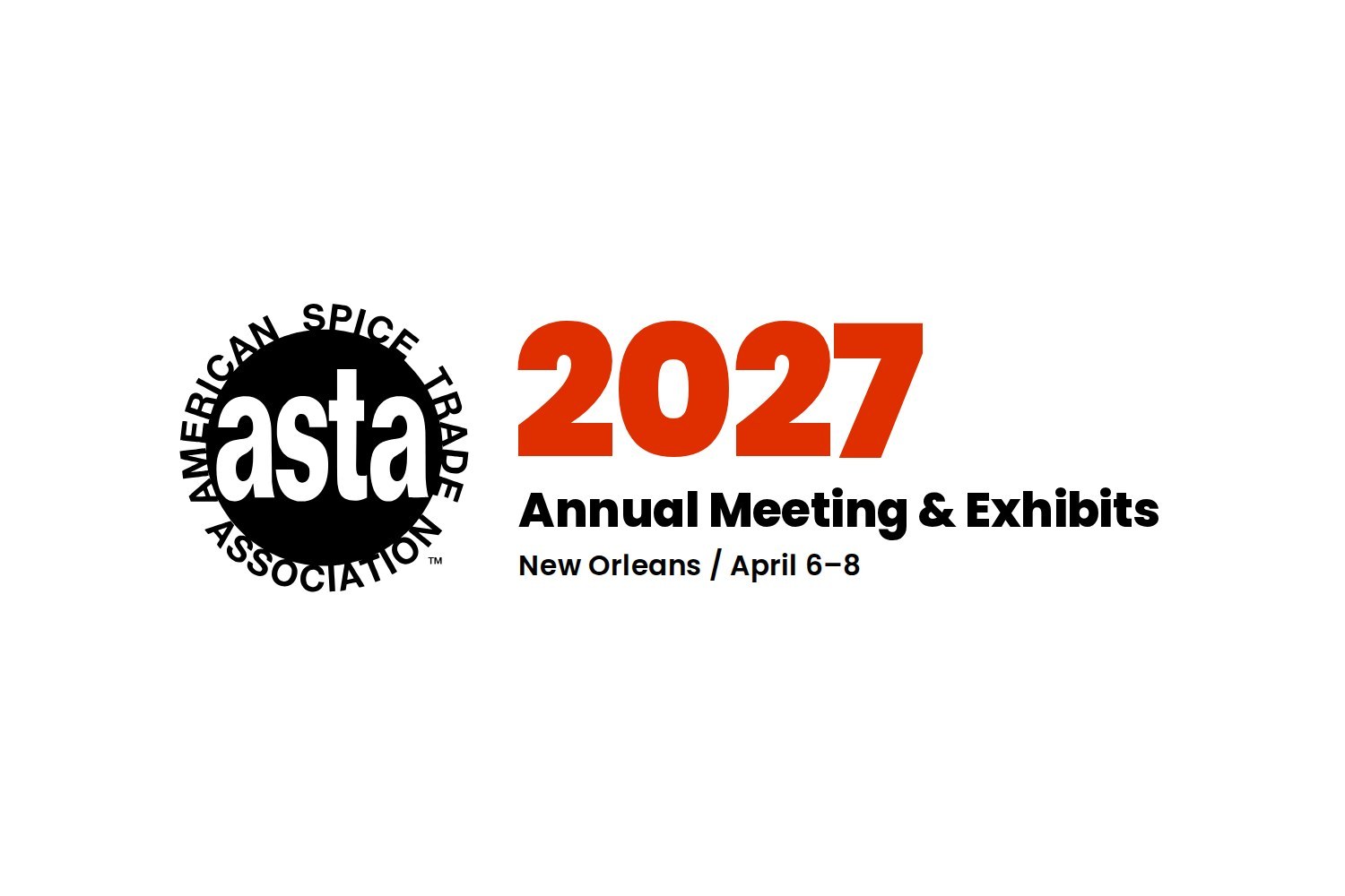
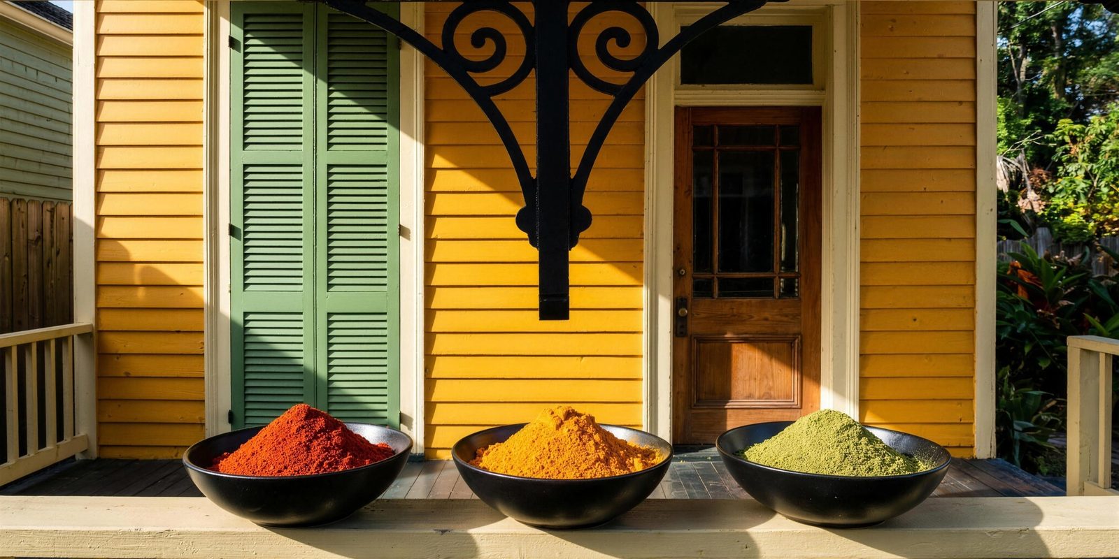
Loud and tight, like a great brass band. Hard sun, painted shotgun houses and spices in full color, built on ASTA’s paprika, turmeric and herb green.
Event lockup
Color
All four ASTA spice colors lead. Brass is for metallic accents and foil.
Typography
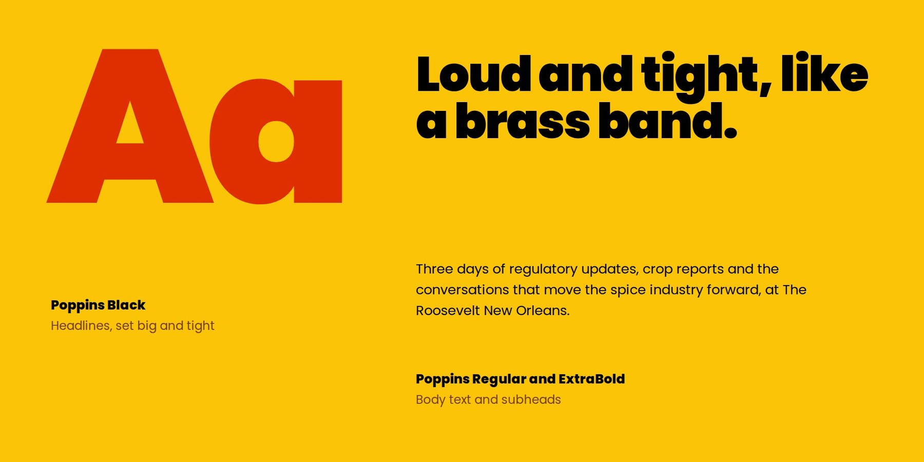
- Headlines
- Poppins Black
- Body
- Poppins Regular and ExtraBold
Big, tight headlines with strong contrast in scale. Everything else stays simple so the color can do the talking.
Moodboard
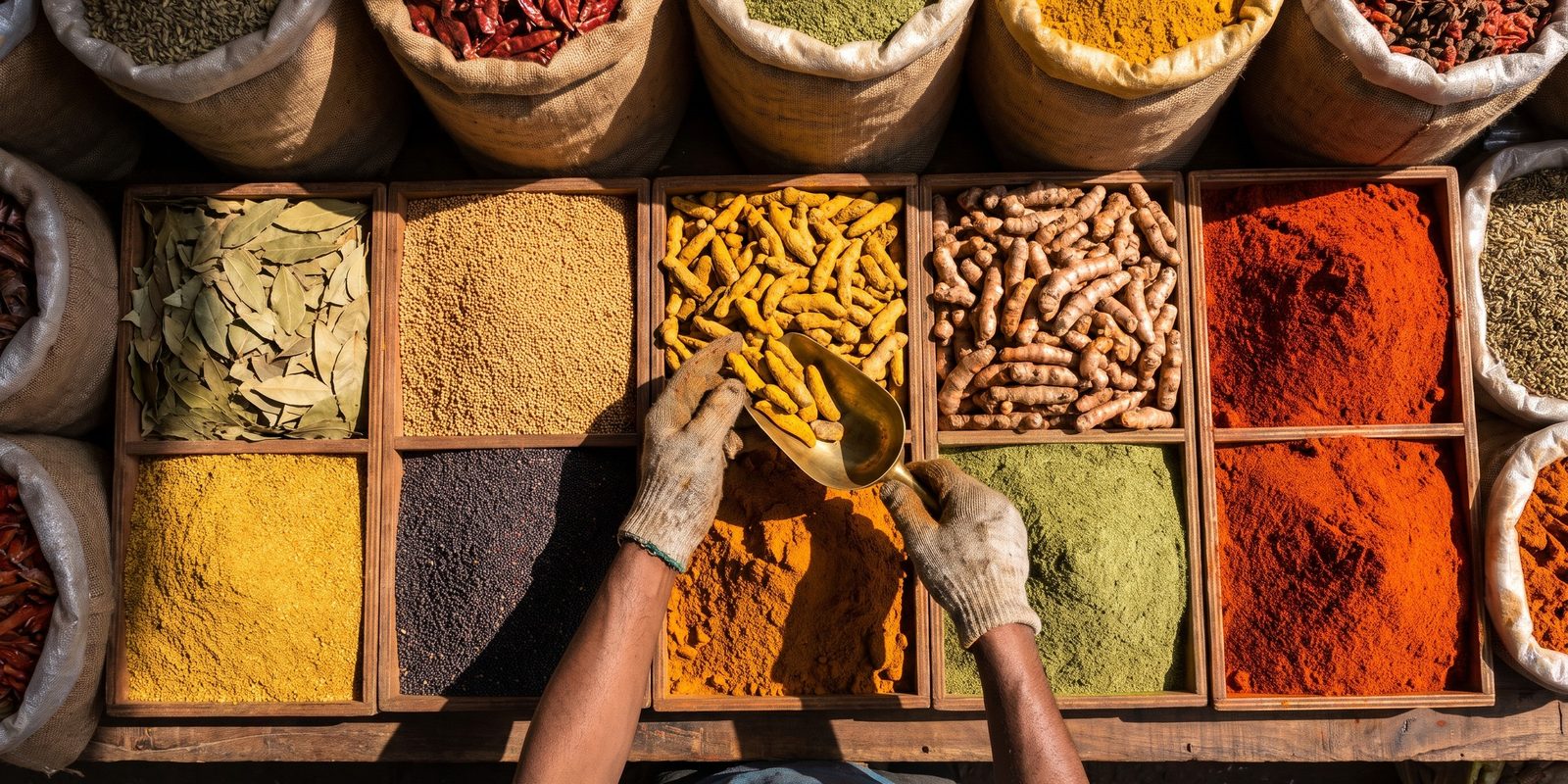


Visual style
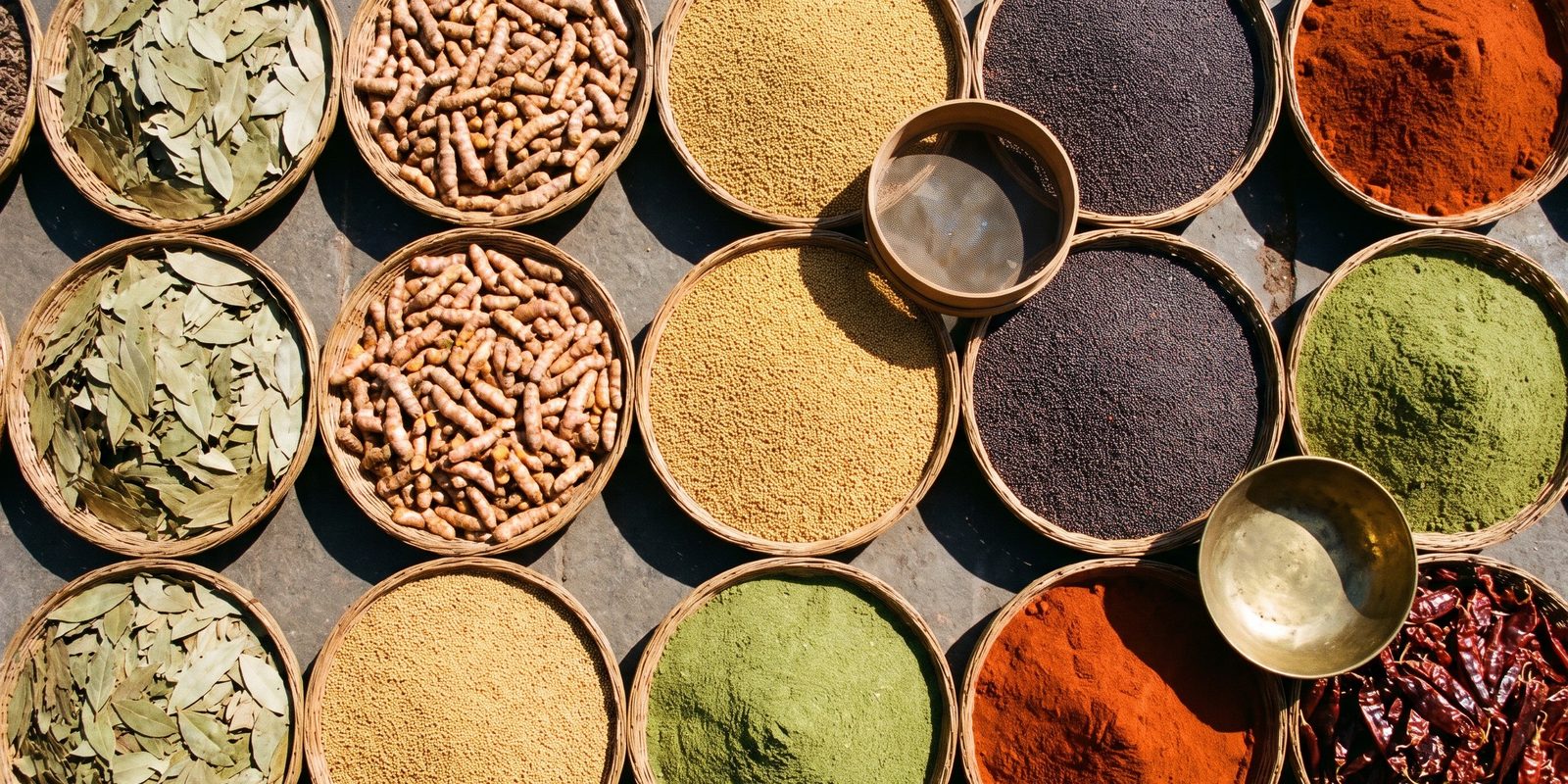
Saturated color blocks, hard shadows and abundant spice: filé, cayenne, paprika, turmeric, mustard seed and bay leaf.
Pattern
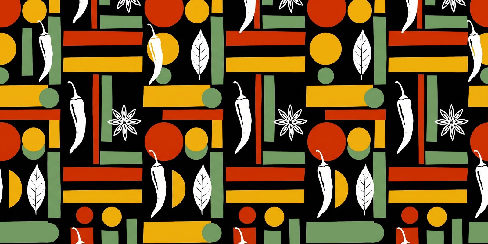
A screen-print-style repeat of syncopated bars and dots with chile, bay leaf and star anise shapes, in the four ASTA colors.
In use
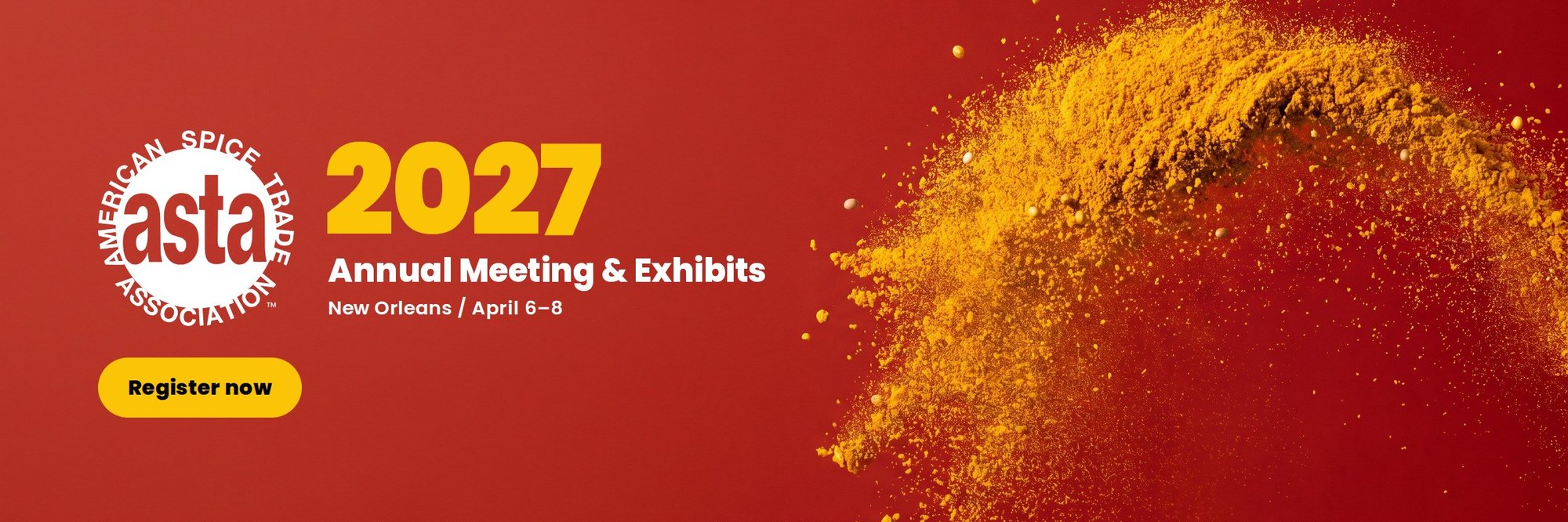
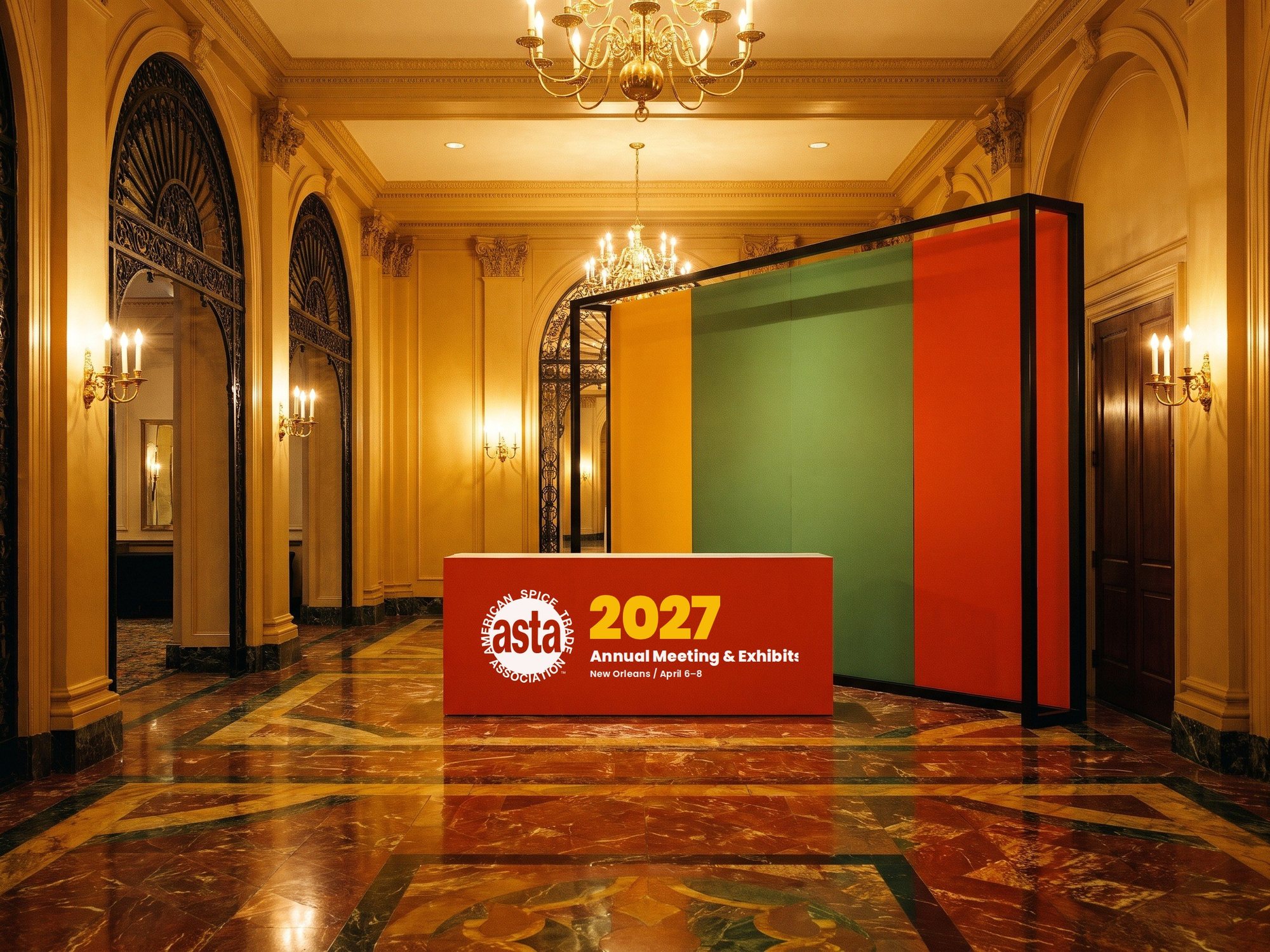

Direction 3
Unexpected
Experimental, artistic, memorable
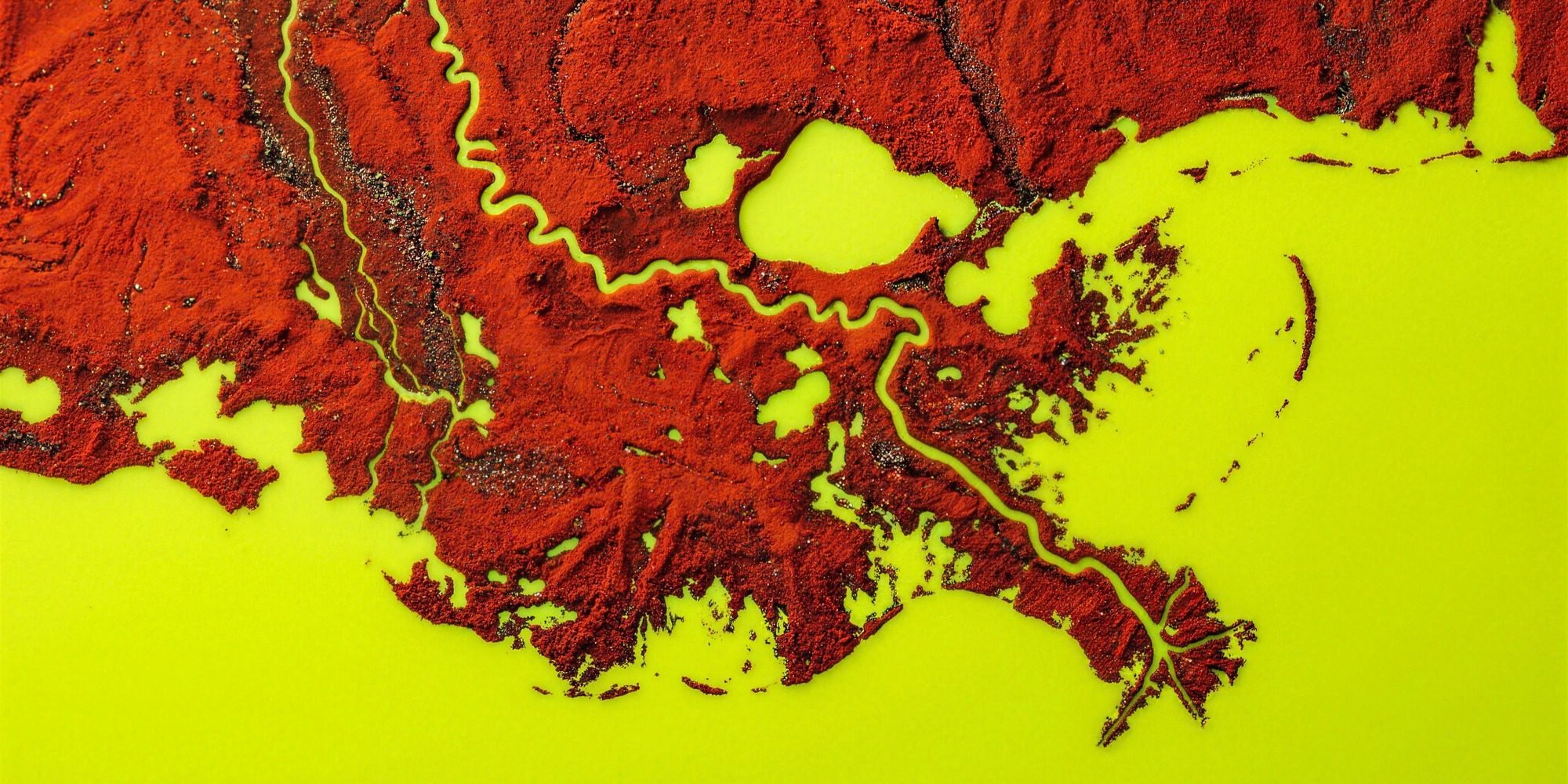
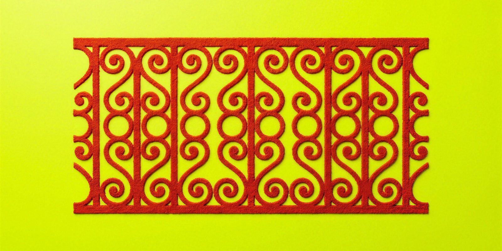
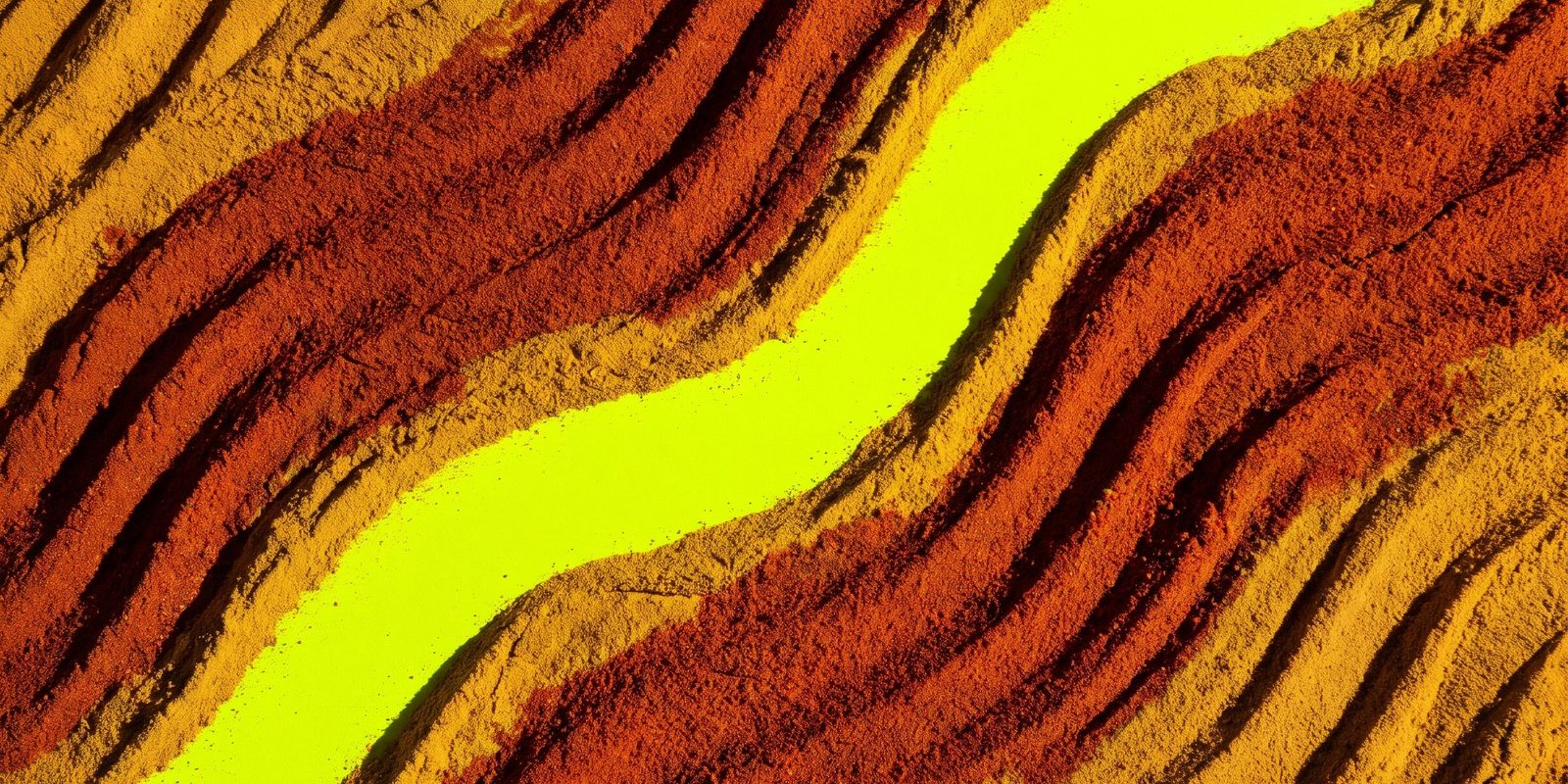
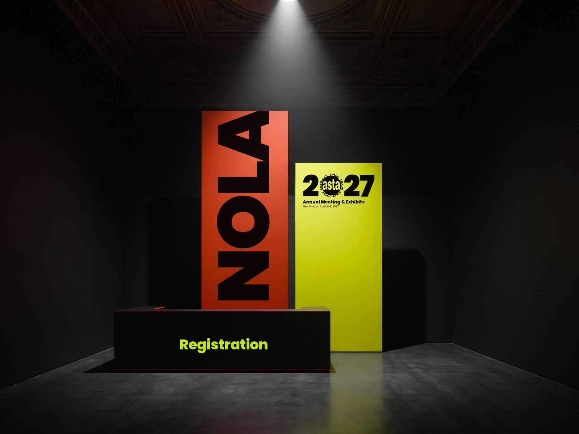
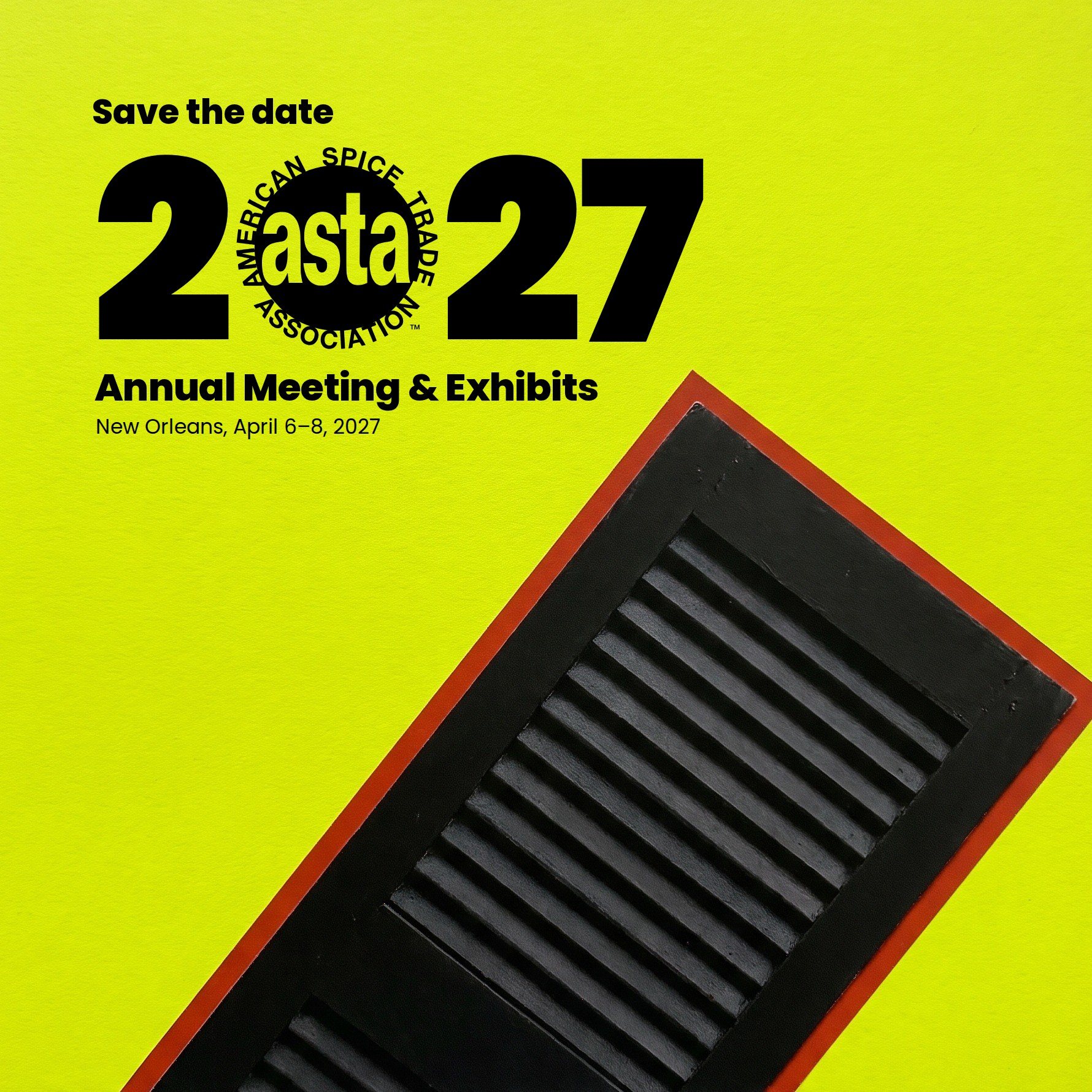
New Orleans and the spice trade, reimagined: the Mississippi delta drawn in paprika, ironwork sculpted from spice, and an acid chartreuse nobody expects from a trade association.
Event lockup
Color
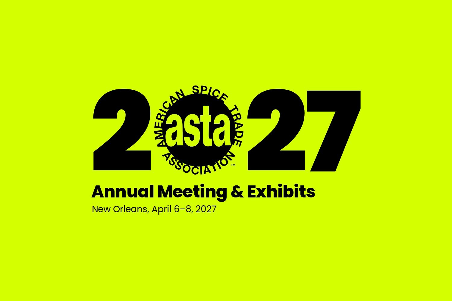
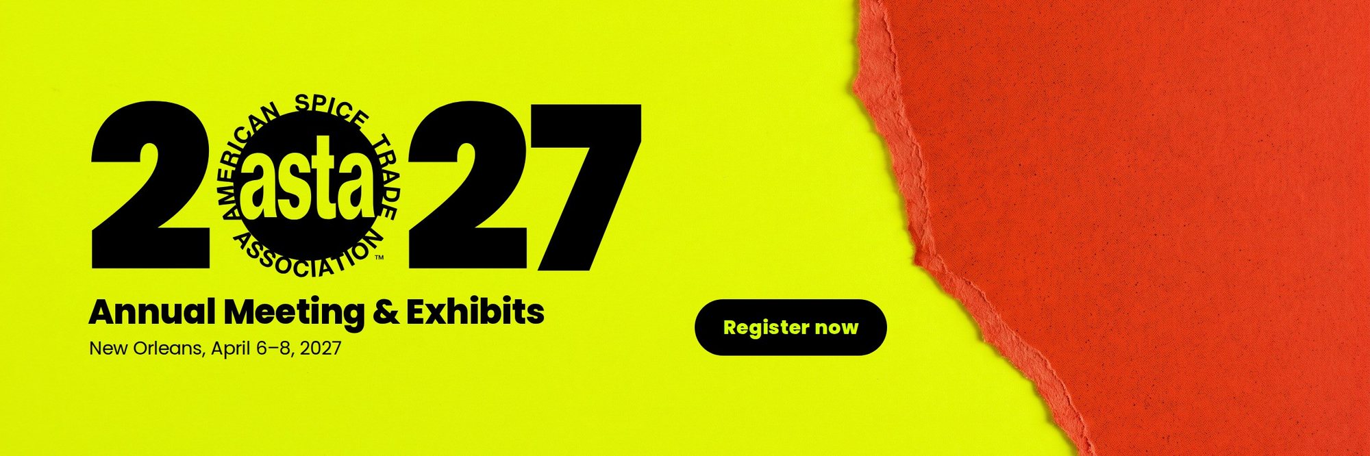
Chartreuse prints as a special ink (a fluorescent or Pantone spot color), and type on it is always black.
Typography
- Headlines
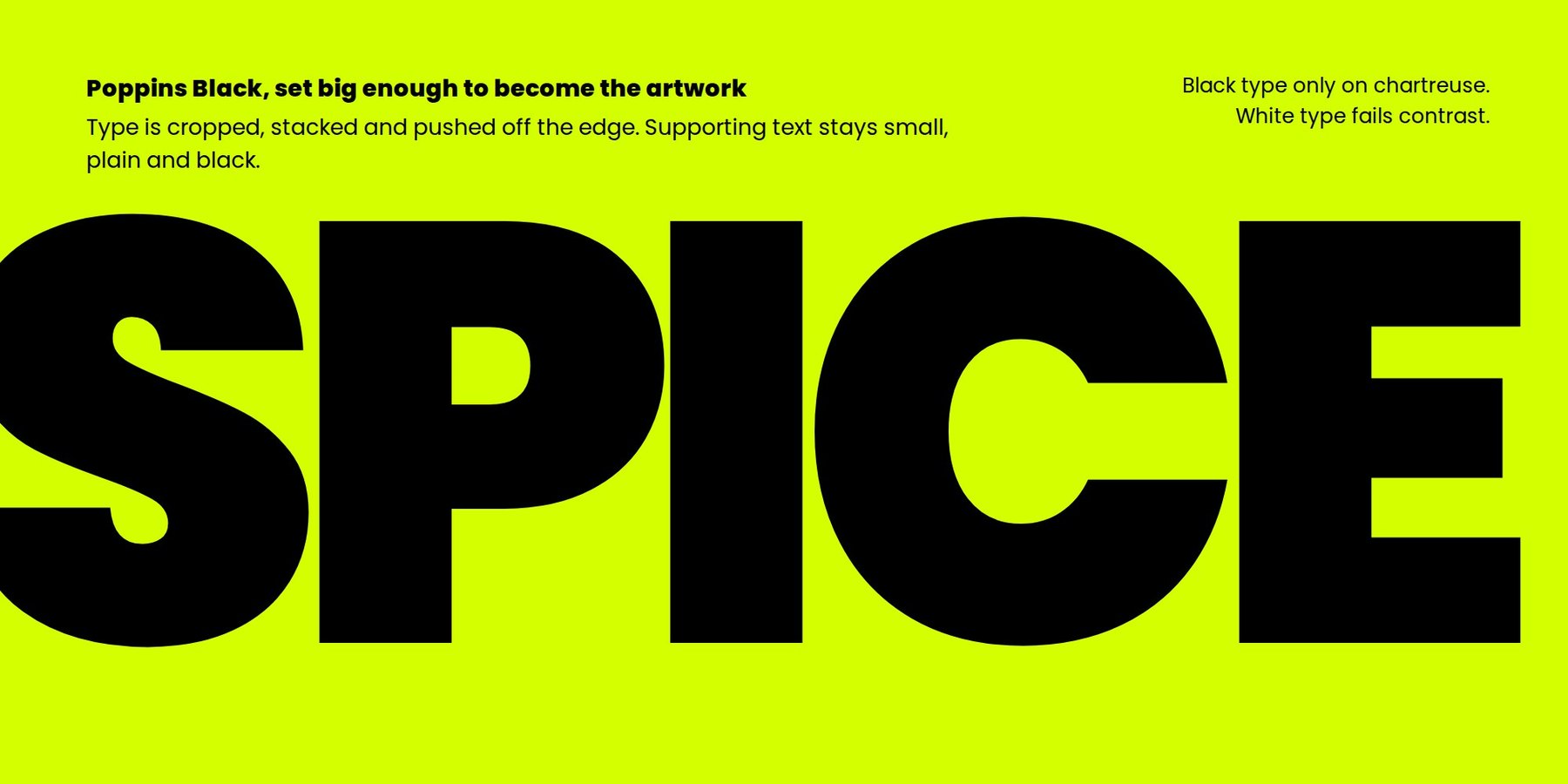
- Poppins Black, oversized
- Body
- Poppins Regular
Type is cropped, stacked and pushed until it becomes part of the artwork. In the lockup, ASTA’s logo stands in for the zero in 2027.
Moodboard


Visual style
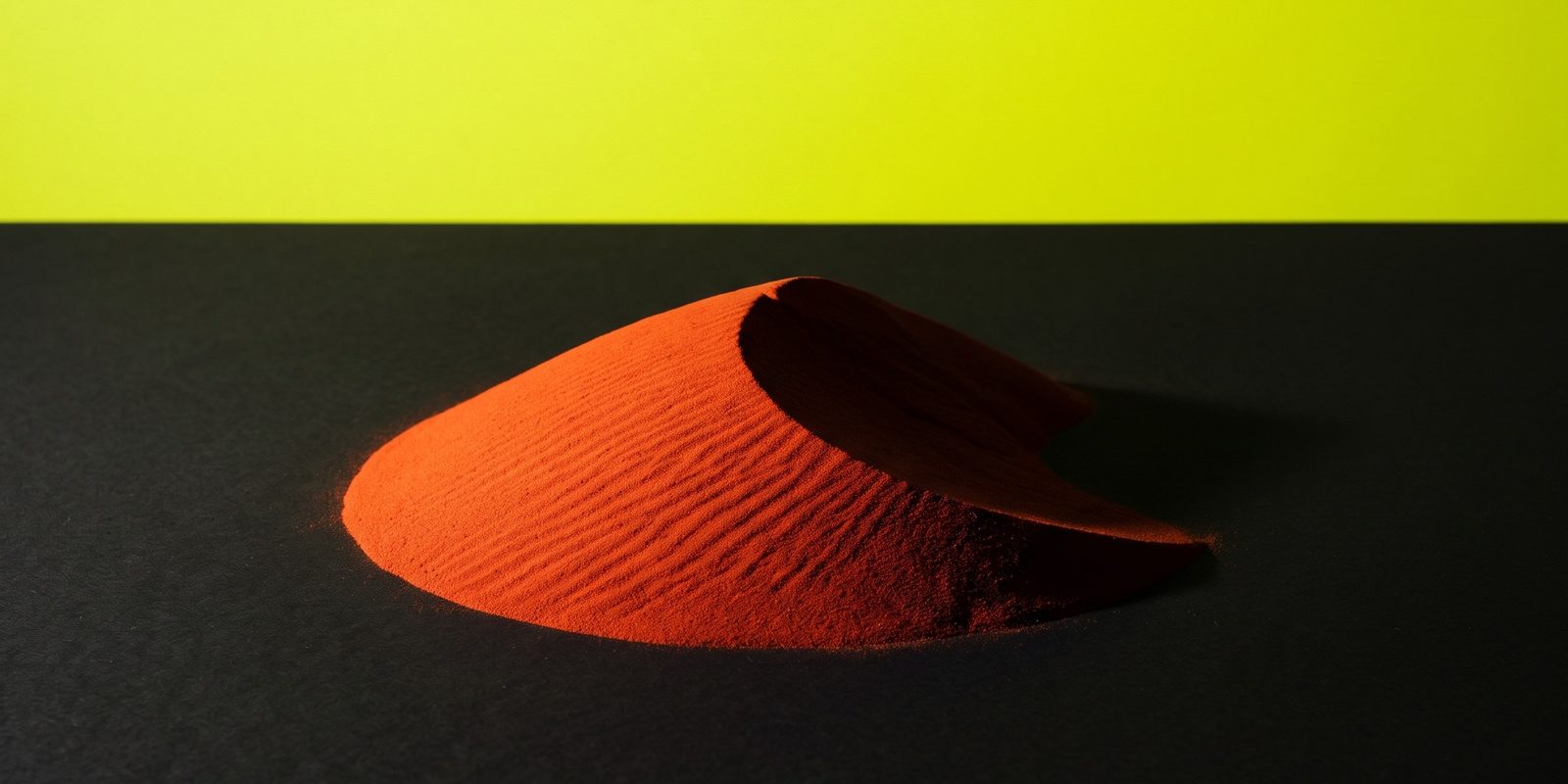
Unconventional crops, exaggerated scale and spice treated as landscape.
Pattern
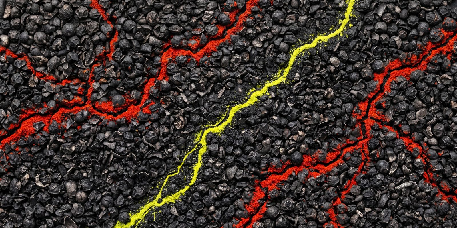
Cracked-pepper terrain with paprika and chartreuse veins, used as the signature texture.
In use
Round 1 results
Four people on ASTA’s team ranked the directions. A first choice counted for 3 points, a second for 2 and a third for 1. Three of the four ranked Bold first.
- Bold makes a statement. It was called the most eye-catching direction, the best look overall and the one that fits ASTA best.
- Music belongs in it. The instruments-with-spices idea was a favorite, with the trumpet and the spice pattern singled out, along with the bold New Orleans colors and ironwork in ASTA black.
- One accessibility question. Is red text on a yellow background readable enough? The refined direction answers it with tested color rules.
- Two keepers from Unexpected. The delta drawn in spices, as a nod to the spice trade and the port of New Orleans, and the tight “2[logo]27” wordmark. Its vibrancy and modern look were liked, but as a whole it was a bit too much.
- No chartreuse. Nobody liked it, and it doesn’t align with ASTA’s colors, so it is gone.
- Classic felt too calm. All four responses described it as calm, muted or boring.
Feedback for this round is closed. Thank you to everyone who responded. To respond to the refined direction, use the form on the home page. Dates and next steps are on the Project & timeline page.